
Table of Contents:
Begin with the Venue: White Draping and Grand Chandeliers
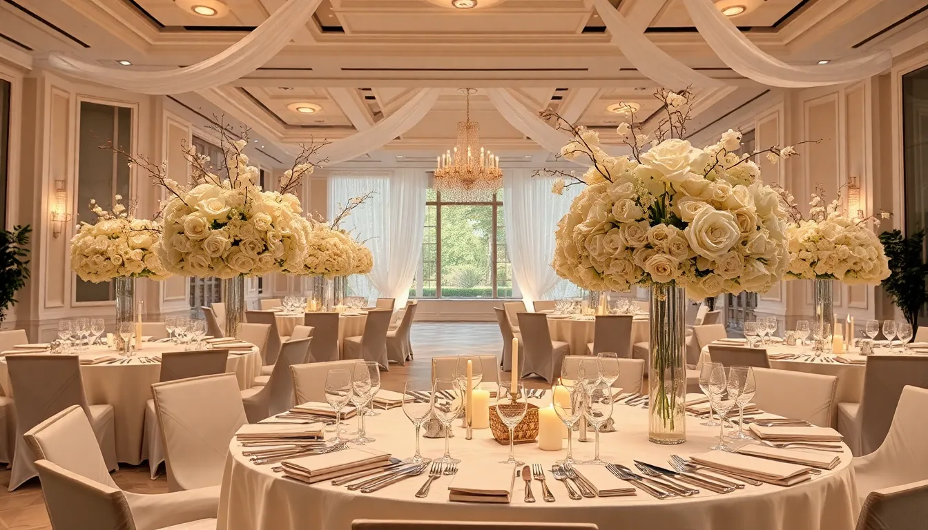
White draping can turn a plain reception room into a soft, glowing setting. Use it to frame the space, not hide it. Let fabric gather at the entrance, sweep behind the head table, or fall in narrow panels from the ceiling. This creates a sense of height while keeping the room open and breathable.
Choose fabric by the venue’s structure. Lightweight voile gives a cloudlike effect. Cotton muslin feels warmer and more relaxed. Satin adds shine, but too much can look harsh under strong lights. For a refined result, combine matte white panels with a subtle sheer layer. The contrast catches light without becoming flashy.
Before installation, measure the ceiling height, wall width, fire exits, sprinkler heads, and power points. Ask the venue for its approved rigging plan. Fabric must never block emergency routes, cover safety equipment, or hang from an untested fixture. In many venues, only certified riggers may attach décor overhead.
Make the ceiling treatment work with the room’s architecture. In a long hall, parallel fabric lines can soften the tunnel effect. In a square room, a central canopy can create focus above the dance floor. For a low ceiling, keep the drape close to the walls and use upward lighting instead of heavy overhead swags.
Grand chandeliers should add structure and sparkle. A cluster of smaller fixtures often feels more luxurious than one oversized piece. Hang them above the dance floor, dining area, or entrance—not all three. A clear focal zone keeps the design polished.
- Keep the lowest chandelier point at least 30 inches above guest tables.
- Use dimmable bulbs between 2,700 and 3,000 kelvin for warm evening light.
- Check the fixture’s weight against the venue’s ceiling load limits.
- Hide cables in approved channels and keep connectors away from wet areas.
- Test the lighting after sunset, when glare and shadows are easier to spot.
For drama, wash the draped walls with warm ivory light. Then aim a few narrow beams at the chandeliers so their crystals shimmer without blinding guests. Avoid saturated red or blue uplighting; it can distort photographs and make white fabric look grey or purple. A restrained lighting plan feels more expensive.
Use the draping as a visual frame for key moments. A fabric arch can mark the ceremony space and later open the room for dinner. A gathered backdrop can define the couple’s table without demanding a large floral installation. If the venue already has ornate walls or historic details, leave selected sections exposed. Opulence needs breathing room.
Create a Luminous Tablescape with Lamps and Wildflowers
Set small table lamps with clear glass shades among loosely arranged wildflowers for a reception table that feels warm, lively, and carefully unpolished. The lamps provide a steady glow, while the flowers bring movement and a sense of place. This pairing works especially well in a vineyard, garden, or countryside venue where a rigid floral design might feel out of step.
Keep the palette focused. White flowers can form the base, while a few red blooms add visual punctuation. Use flowers with different silhouettes, such as open-faced blooms, slender stems, and airy umbels. The result should look gathered rather than engineered. Luxury is not always about perfect symmetry.
Choose compact lamps with weighted bases and low-voltage LED bulbs. Battery-powered models reduce cable clutter, but test their runtime before the event. A reception dinner may last five hours or more, so select units rated beyond the planned service time. Warm light around 2,700K creates a flattering tone for skin, linen, and glassware.
Protect the table from spills and heat. Place every lamp on a slim tray or a discreet cork pad, and keep its switch easy for staff to reach. Never allow foliage to touch a bulb, vent, or charging port. If the design uses fresh flowers, ask the florist to condition the stems and remove pollen-heavy varieties that may stain napkins or trigger discomfort.
- Use one lamp for a small round table or two for a longer banquet table.
- Keep the light source below eye level so guests can speak across the table.
- Repeat one flower or vessel detail to connect separate tables.
- Leave clear space around place settings, wine glasses, and serving dishes.
- Add small sprigs of lavender near, rather than inside, the main arrangements.
For an extra note of charm, echo the floral theme in the food presentation. Flower-shaped butter, herb-finished bread, or lavender used in a controlled culinary garnish can make the table feel considered from stem to plate. Check that every edible botanical is food-safe and approved by the caterer. Fresh lavender should never be treated as an automatic garnish.
Photograph the setup from a seated guest’s view before approving it. The table may look abundant from above yet feel crowded at eye level. Trim any stem that blocks conversation, soften harsh lamp reflections, and check the arrangement under both daylight and evening conditions.
Editorial note: This concept is adapted from the tablescape ideas discussed by Shelby Wax in Vogue, published on September 26, 2025. The practical safety and styling guidance above is original editorial analysis.
Layer Vintage Lace, Silver Vessels, and White Blooms
Layer vintage lace, white blooms, terracotta, and aged silver to give the reception a romantic character with real material depth. The strongest version does not look newly matched. It feels collected over time, as if each piece has a small story behind it.
Begin with lace as a surface rather than a full costume. A lace runner over natural linen can soften a long table without making it feel fussy. For round tables, use a narrow central panel or lace-edged napkins instead of covering the entire cloth. This leaves enough plain fabric for the pattern to breathe.
Pair white flowers with vessels that do not share the same finish. Terracotta pots bring a dry, earthy note. Tarnished silver adds cool reflection. Clear glass can sit between them as a quiet bridge. If every container shines, the table may feel more like a showroom than a celebration.
Choose flower forms with restraint. Garden roses, sweet peas, ranunculus, and delicate white cosmos can create a soft, layered effect. Keep the stems at a practical length, especially where guests face one another. A beautiful arrangement becomes awkward when it interrupts conversation or brushes against sleeves.
Before using antique silver, check its condition. Some older pieces contain finishes or residues that should not touch water, food, or edible items. Place a watertight liner inside decorative vessels, and use a separate food-safe dish for fruit or sweets. This protects both the heirloom and the table.
- Wash lace according to its fibre content; vintage cotton may shrink or tear.
- Use felt or clear protective pads beneath silver and terracotta.
- Line porous pots with sealed inserts to prevent rings on the linen.
- Keep floral foam and standing water away from delicate lace.
- Ask the rental team to photograph each heirloom before collection.
Add botanical detail through candleholders or lanterns with pressed-leaf motifs. Their pattern can echo the lace without copying it. Choose unscented candles during dinner so the fragrance does not compete with the menu, wine, or flowers.
For a genuine vintage mood, avoid making every place setting identical. Repeat the main materials across the tables, then vary one small element: a different silver vessel, a distinct lace edge, or a slightly altered flower shape. That controlled irregularity keeps the room graceful rather than staged.
This layered approach draws on the tablescape concepts discussed by Shelby Wax in Vogue on September 26, 2025, including lace, white flowers, terracotta, silver vessels, and botanical candlelight. The safety, sourcing, and styling recommendations here provide additional editorial guidance.
Add Artistic Contrast with Colorful Candelabras
Use colorful candelabras as the artistic anchor of a refined reception table. Painted flowers, birds, or small decorative motifs can introduce personality without relying on a large floral installation. Keep the surrounding flowers mostly white or softly neutral so the painted details remain the visual surprise.
Match the candelabra’s colors to two or three quiet accents elsewhere in the room. Violet shades can appear in napkins or small paper details, while gold may return in votive holders or menu lettering. This creates a visual thread without turning the table into a color catalogue.
Consider the silhouette before choosing the finish. A branching candelabra suits a long banquet table, while a compact design works better on a small round table. Measure the base, arm span, and candle height together. Decorative pieces that look elegant in a showroom can quickly consume useful dining space.
Use dripless, unscented candles in a size approved for the holder. Taper candles should sit firmly in their sockets, with no wobble or improvised support. Place a discreet heat-resistant mat beneath each base, and keep menus, napkins, ribbons, and trailing foliage well away from the flame.
- Check whether the venue permits open flames before signing the rental order.
- Choose LED tapers when the site has strict fire rules.
- Inspect painted surfaces for chips, flaking, or sharp edges.
- Keep every flame below the sightline needed for comfortable conversation.
- Ask staff to replace candles during a planned service pause, not during speeches.
A neutral floral arrangement can make the painted metal feel even bolder. White blooms act like a calm canvas, while purple shades in nearby textiles deepen the artistic mood. Gold-toned candlelight then adds warmth rather than competing sparkle.
Do not force identical candelabras onto every table. Repeat the same color family, then vary the painted pattern or scale. This approach gives the reception a collected gallery feel while preserving enough order for the room to look intentional.
This concept reflects the colorful candelabras, neutral flowers, violet accents, and gold details described by Shelby Wax in Vogue on September 26, 2025. The guidance on proportions, flame safety, and event use adds practical editorial analysis.
Replace Floral Centerpieces with Sculptural Candlelight
Replace a traditional floral centerpiece with a sculptural field of candles arranged in rounded clusters. On a circular table, this creates a glowing composition that feels deliberate without blocking the view across the table. The shape can echo the table itself, giving the setting a calm, almost architectural rhythm.
Use several candle diameters to build the form. Broad pillar candles create the visual mass, while smaller cylinders fill gaps and add flickering detail. Keep the arrangement low enough for conversation, and leave a clear perimeter for plates, cutlery, and shared dishes. The goal is a luminous object, not a wax obstacle course.
Choose a controlled color scheme. Ivory and warm white create a soft, classic effect; smoke, sand, or muted clay can make the display more contemporary. Avoid too many shades, since candlelight already changes the appearance of nearby surfaces. Unscented wax is the safest choice for a dining table, especially when the menu includes delicate aromas.
Safety needs to shape the design from the beginning. Select stable, non-drip pillars and place them on heat-resistant trays or stone slabs. Keep each flame away from napkins, menus, sleeves, foliage, and hanging fabric. Follow the venue’s fire policy, provide snuffers for staff, and appoint one person to monitor the display throughout the meal.
- Use battery-operated candles where open flames are not permitted.
- Choose LED candles with a warm flicker rather than a cold, blue-white glow.
- Leave a visible gap between candle groups to prevent heat buildup.
- Protect polished tables with discreet, non-slip bases.
- Test the arrangement from every seat before guests arrive.
This idea suits an evening reception because the design grows richer as daylight fades. During the first course, the candles may look simple. Later, their reflections collect in glassware and metal cutlery, creating movement without extra decoration. It is a quiet kind of theatre.
Keep the rest of the table edited. A sculptural candle display already supplies shape, light, and repetition, so excessive stationery, crystal ornaments, or competing décor can dilute its impact.
The concept follows the candle-only spherical arrangements featured in Shelby Wax’s Vogue article, published September 26, 2025. The practical advice on scale, placement, scent, and fire control adds original editorial guidance.
Build Romantic Tables with Pastels, Lamps, and Soft Candlelight
Build a soft, painterly tablescape with pastel flowers, green-and-cream details, and gentle candlelight. The aim is not a sugary look. Balance pale tones with aged finishes, patterned textiles, or one deeper accent so the table feels romantic but still grown-up.
Use a limited pastel palette. Blush, butter yellow, powder blue, and pale lilac can work together when one shade leads and the others support it. A useful rule is to let about 60% of the floral color come from the main tone, 30% from a secondary shade, and 10% from a sharper accent. This keeps the arrangement expressive rather than muddled.
Choose flowers with a soft, abundant shape. Peonies, sweet peas, stock, tulips, and garden-style roses create fullness, while small filler blooms add a hazy edge. Ask the florist to avoid overly tight domes. A slightly irregular outline feels more natural and allows the pastel colors to catch light from different angles.
Bring in patterned table lamps with green-and-cream shades as decorative punctuation. Their printed surfaces can tie the flowers to the table without adding another floral centerpiece. Place them where they illuminate menus or glassware, not directly behind a guest’s head. A small adjustment can improve photographs considerably.
Use beige taper candles to warm the cooler pastel notes. Their sandy color is gentler than stark white and works well with cream linen, pale wood, and brushed metal. Select a candle finish that suits the table: matte wax feels relaxed, while a subtle sheen adds a more formal glimmer.
- Use a matte linen cloth to prevent pastel colors from looking overly glossy.
- Repeat the leading flower color in menus, escort cards, or ribbon details.
- Keep candle holders slim so the floral volume remains the main feature.
- Use water tubes for delicate cut stems placed in small decorative details.
- Check the color balance under warm evening light before final approval.
Fragonard-style pastoral scenes offer a useful mood reference: airy, playful, and full of gentle movement. You do not need literal artwork at every place setting. A floral border on stationery, a softly painted menu card, or a small patterned textile can suggest the feeling without making the reception look themed.
Preserve the pastel effect through the meal. Strongly colored sauces, dark napkins, or brightly printed packaging can interrupt the visual story, so ask the caterer and rental team to review the table as one composition.
For an intimate finish, add one personal object with a muted surface, such as a small ceramic keepsake or a framed family image. Keep it separate from food and service areas, and use only a few meaningful pieces.
The pastel floral, beige candle, and patterned lamp approach is based on the tablescape ideas reported by Shelby Wax in Vogue on September 26, 2025. The palette ratios, placement advice, and coordination methods provide additional editorial guidance.
Use Wildflowers, Rope-Wrapped Glass, and Natural Texture
Use local wildflowers in matching rope-wrapped glass vessels to create a tablescape that feels rooted in its setting rather than imported from a catalogue. This approach suits a meadow, vineyard, coastal garden, or historic rural venue, especially when the surrounding landscape already supplies strong visual character.
Choose flowers that are genuinely available in the wedding season. Queen Anne’s lace, yarrow, cornflowers, chamomile, scabiosa, and grasses can create an airy field-like effect, but availability varies by region. Ask the florist to identify each stem and confirm whether it is cultivated, responsibly gathered, or protected. “Wildflower style” does not mean collecting plants from public land.
Rope adds a tactile, handmade note to otherwise simple glass. Use the same rope thickness and wrapping direction on each vessel, leaving the upper glass clear so stems remain visible. Natural jute feels rustic; pale cotton cord looks cleaner; waxed linen gives a more tailored finish. Keep the wrapping secure and away from water lines.
Use watertight inserts inside decorative glass, particularly when the rope cannot be removed for cleaning. Fresh stems should be conditioned before placement, and cloudy water should be replaced during the event if needed. A florist can also use water tubes for fragile flowers, preventing leaks and keeping the vessels easier to handle.
- Choose vessels with a broad base so uneven outdoor surfaces do not cause tipping.
- Keep rope dry and inspect it for loose fibres before placing it near food.
- Use untreated materials when possible, as dyes and finishes may transfer when wet.
- Ask the venue about insects, pollen, and plant-allergy concerns.
- Compost suitable green waste and separate glass, wire, and synthetic ties after the event.
Let the arrangements vary in shape, but repeat one unifying detail, such as the same glass profile or rope color. A few taller stems can add lift, while shorter clusters keep the view open. Avoid making every vessel identical in size; natural texture needs a little room to wander.
Carry the local idea beyond the flowers through menu ingredients, place-card paper, or a restrained material accent. Do not scatter loose soil, moss, or untreated bark beside plates. Natural styling still needs clean boundaries, particularly where food and formal service meet.
For a serpentine or irregular table, follow the curve with small groups instead of forcing one continuous arrangement. This preserves the table’s movement and makes replacement easier if a vessel breaks. The finished look should feel gathered from the landscape, not copied from it.
The wildflower and rope-wrapped glass concept follows the regional, organic tablescape described by Shelby Wax in Vogue on September 26, 2025. The sourcing, hygiene, stability, and sustainability recommendations add practical editorial guidance.
Mix Small Bud Vases with Full, Colorful Arrangements
Mix small bud vases with fuller arrangements to give the reception table a relaxed rhythm without losing polish. The small vessels carry color into empty spaces, while the larger designs create a clear visual anchor. This pairing works well when you want a lively table that still leaves room for plates, shared dishes, and conversation.
Use the bud vases as small color notes rather than miniature copies of the main arrangement. Pink, violet, and yellow flowers can be divided across the table in a loose sequence. Repeat each color at least twice, but avoid placing matching shades in a strict pattern. A little asymmetry makes the design feel more natural.
Choose flowers for the small vases by stem quality, not just bloom size. Single dahlias, spray roses, miniature carnations, sweet peas, and slender tulips can each make an impact when displayed alone. Cut stems at different lengths, then remove leaves below the waterline to keep the vessels clear and fresh.
- Use narrow-necked vases for delicate stems and wider openings for fuller blooms.
- Fill each vessel before placing it on the table to prevent spills on the linen.
- Keep a small water reserve and replacement stems in the venue’s service area.
- Place shorter vases near shared plates and taller ones toward unused table zones.
- Label fragile pieces for the setup team so they are handled with care.
Let the large arrangement carry the strongest shape. It might have a rounded profile, an open fan, or a loose crescent, while the bud vases echo only its colors. This prevents the table from becoming visually noisy. Think of the smaller vessels as punctuation marks, not extra sentences.
For long tables, distribute the full arrangements at measured intervals and use bud vases between them. For round tables, place the larger design slightly off-centre only when it will not interfere with service. On very small tables, two or three bud vases may be enough; abundance is not measured by quantity alone.
Protect guests and flowers by keeping water away from paper goods and electrical items. Use stable bases, inspect glass for chips, and avoid varieties that shed heavily during dinner. The final arrangement should look generous, but it must remain easy for staff to clear and reset.
This small-vase and fuller-arrangement combination reflects the colorful tablescape approach described by Shelby Wax in Vogue on September 26, 2025. The placement, flower-care, and service recommendations add practical editorial guidance.
Style a Timeless “Something Blue” Tablescape
Build a timeless “Something Blue” tablescape with silver vessels, white roses, ranunculus, and pale blue blooms. The palette feels refined because the blue remains gentle rather than dominant. It also gives the traditional detail a clear visual role instead of treating it as a last-minute accessory.
Use silver as the reflective foundation. Polished pieces create crisp highlights, while aged silver gives the setting more softness and history. Combine one finish with care; too many competing metals can weaken the calm, classic effect. Line decorative vessels with watertight inserts before adding flowers.
Keep the floral recipe simple. White roses supply volume, ranunculus add layered petals, and pale blue flowers create a cool thread through the arrangement. Suitable options may include delphinium, tweedia, hydrangea, or seasonal bluebells, subject to local availability. Ask the florist to confirm that every chosen stem is safe around guests and suitable for the expected temperature.
Place small clusters of grapes at the foot of selected arrangements to introduce an abundant dinner-party note. Use clean, food-grade fruit and keep it away from floral water, wire, and treated surfaces. Grapes can also support the menu story if the meal includes regional wine or a late-summer harvest theme.
- Choose one pale blue family rather than mixing electric and powder shades.
- Use fruit only where staff can remove it easily before dessert service.
- Keep silver polished enough to reflect light but not so bright that it creates glare.
- Protect linen with discreet coasters beneath heavy vessels and fruit dishes.
- Confirm that floral mechanics remain hidden from guests and catering staff.
Balance the cool palette with warm ivory stationery or natural wood accents. This prevents the table from feeling icy, especially in a room with pale walls. Blue ribbon, a small embroidered detail, or hand-painted place cards can carry the theme without repeating the flowers.
The arrangement should feel effortless, but the timing is not casual. Ranunculus and roses need careful conditioning, and cut fruit should be prepared as close to service as practical. Schedule a final inspection shortly before guests enter so bruised petals, dull silver, or split grapes do not interrupt the illusion.
This silver, white, blue, and grape combination follows the tablescape concept described by Shelby Wax in Vogue on September 26, 2025. The sourcing, food-handling, vessel, and styling notes add practical editorial guidance.
Make the Reception Personal with Sculptures, Fruit, and Meaningful Objects
Make the reception feel unmistakably yours by placing a few sculptures, fruits, and meaningful objects where guests can discover them naturally. The strongest details do not simply fill space. They reveal a shared interest, family story, hometown, or small private joke.
Choose one visual theme for personal objects. A collection of ceramic birds may suggest travel or freedom; small busts can reflect an interest in art; vintage book spines can nod to a couple’s favourite writers. Keep the objects within one material or colour family so the display feels curated rather than cluttered.
Use heirlooms with care. A marble slab from a family home can serve as a discreet base for a non-food sculpture or a sealed decorative element. Do not place valuable antiques directly beside drinks, candles, or serving dishes. Photograph each item before delivery, record its owner, and assign one person to oversee collection after the reception.
Fruit can add colour, season, and abundance without looking like a standard floral accessory. Pears, figs, citrus, or pomegranates may support the menu or location story. Select firm, clean produce with no bruises, and separate display fruit from fruit intended for eating. Never place food on a surface that has held floral chemicals, polish, wax, or untreated decorative materials.
- Use sealed bases beneath sculptures to prevent scratches on rental furniture.
- Keep fragile pieces away from serving paths, children’s seating, and crowded entrances.
- Limit each table to one clear personal story instead of several unrelated ones.
- Ask the caterer to approve all edible displays and handling methods.
- Create a labelled return box for family pieces before guests arrive.
Personal objects can also guide the reception’s wayfinding. A small sculpture may mark the sweetheart table, while framed photographs can identify a lounge or memory table. Keep names and seating information easy to read; emotional detail should enrich the experience, not make guests search for their place.
Scale matters more than price. One substantial object usually has greater impact than many tiny souvenirs. Place it where guests can see its shape, then give it visual space. A rare piece hidden among excessive décor loses its meaning.
For a coherent finish, connect the objects to the couple’s story through discreet captions or a short menu note. Explain only what adds warmth. Guests do not need a museum label for every item; one thoughtful sentence can turn a beautiful object into a shared moment.
The use of sculptures, decorative birds, fruit, and personal materials draws from the tablescape ideas discussed by Shelby Wax in Vogue on September 26, 2025. The recommendations on conservation, food safety, documentation, and guest flow provide additional editorial guidance.
Design Opulent Floral Statements with Sunset Roses and Tonal Color
Create an opulent floral statement with hundreds of roses arranged in a flowing colour story from golden yellow through warm blush, coral, soft mauve, and pale violet. Instead of separating each shade into a block, let the tones overlap gradually. This ombré movement can make a long table feel continuous and gives the flowers the drama of a sunset without adding extra décor.
Choose roses at several opening stages. Tight buds provide definition, half-open blooms create depth, and fully open flowers supply the lush, almost theatrical finish. Ask the florist to source sturdy varieties with similar vase life. A colour match is not enough if one section wilts hours before the others.
Before confirming the quantity, calculate the design by table length. A dense floral runner may require roughly 20 to 30 stems per linear foot, depending on bloom size and foliage. Treat this as a planning range, not a fixed rule. Large garden roses need fewer stems; smaller spray varieties need more. Your florist should make a sample section at the intended density.
Use discreet floral mechanics beneath the flowers. A series of connected trays or water-filled vessels is often safer than placing stems directly into soaked foam across a long surface. Keep the base narrow enough for service staff to pass plates and clear glassware. Opulence should feel generous, never obstructive.
- Reserve extra blooms for repairs, especially in warm venues.
- Condition roses in clean water and remove foliage below the waterline.
- Keep arrangements away from direct sun, heating vents, and cold drafts.
- Confirm delivery timing so the flowers reach the room at peak freshness.
- Use a discreet table plan for dismantling and donating or composting the flowers.
Let the location guide the colour temperature. A lakeside venue may suit cooler mauves and misty violet, while a stone villa can carry richer apricot and wine tones. The reference does not need to be literal. The flowers only need to translate the atmosphere into colour.
Keep stationery and tableware quiet around such a lavish installation. Warm ivory menus, clear glassware, and restrained metal details will support the gradient. Strong patterns can break the visual flow, while too much greenery may hide the colour transition that makes the design special.
The sunset-rose concept reflects the lavish gradient of yellow, pink, and violet roses described by Shelby Wax in Vogue on September 26, 2025, inspired by Lake Como sunsets. The stem estimates, mechanics, conditioning advice, and service considerations are additional editorial guidance.
Conclusion: Unite Height, Texture, Light, and Personal Style
Opulent wedding décor succeeds when every element has a clear job. Let the venue carry the scale, let the tables provide intimacy, and let personal details give the celebration its emotional centre. The result should feel abundant, not crowded.
Before approving the final design, review the room as a guest would. Can people enter without brushing against décor? Can they read menus, see one another, and move safely between tables? Do the colours still look balanced after the room changes from daylight to evening? These practical checks protect the beauty of the plan.
- Keep one dominant visual idea for each area of the reception.
- Use a shared material or colour thread to connect separate spaces.
- Reserve the most dramatic installation for the moment guests will notice it most.
- Plan a clear removal route for fragile, rented, or family-owned pieces.
- Ask the venue to confirm access, rigging, flame, and electrical rules in writing.
A strong design also considers its second life. Choose reusable vessels, rent rather than buy specialist structures, and discuss flower donation or composting before the event. Sustainable choices do not make a celebration less lavish. They make the abundance more thoughtful.
Use the final walk-through as a design edit, not merely a checklist. Remove anything that repeats a nearby detail, blocks service, or adds visual noise. Sometimes the most luxurious decision is leaving one surface quiet. Then the chosen flowers, materials, light, and memories can hold the room with confidence.
The ideas in this article draw on Shelby Wax’s Vogue feature, published September 26, 2025, together with venue-décor concepts involving white draping and chandeliers reported by Wedding Ideas Magazine. Those sources provide inspiration; the planning, safety, access, and sustainability guidance here is editorial analysis intended to support real event decisions.
Frequently Asked Questions About Luxurious Wedding Décor
How can white draping make a wedding venue look more luxurious?
White draping can soften a reception space, emphasize ceiling height, frame key areas, and create a romantic backdrop. Combine matte fabric with subtle sheer layers and warm, restrained lighting for an elegant result.
What lighting works best for an opulent wedding reception?
Warm lighting between 2,700 and 3,000 kelvin works well for wedding receptions. Chandeliers, table lamps, and candlelight can add depth and sparkle, while dimmable fixtures help adjust the atmosphere throughout the evening.
How can wedding centerpieces look abundant without blocking conversation?
Vary the height and scale of flowers, candles, vessels, and decorative objects while keeping the main sightline open. Low arrangements, compact lamps, and carefully placed taller accents can create visual richness without obstructing guests.
Which materials create an elegant wedding tablescape?
Lace, glass, aged silver, marble, terracotta, rope, linen, and natural greenery can add distinctive texture. Repeat selected materials or colors across the reception to create cohesion while allowing individual tables some variation.
How can couples personalize luxurious wedding decorations?
Incorporate meaningful objects such as family heirlooms, sculptures, decorative birds, regional flowers, seasonal fruit, or materials connected to the couple’s story. Use these details selectively so the décor feels personal, curated, and harmonious.