
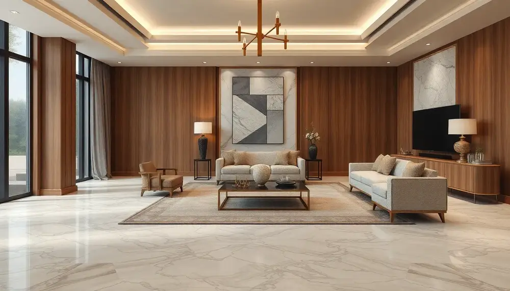
Table of Contents:
Choosing a Luxury Floor Style for Your Home
The right luxury floor begins with the room’s purpose, not with a color sample. A grand entrance can carry a strong pattern, while a calm bedroom often needs softer grain and less contrast. Start by noting traffic, moisture, daylight, pets, children, and the amount of cleaning the space receives. Style matters, but a beautiful floor that cannot handle daily life soon loses its charm.
Use this simple design filter:
- Classic interiors: Choose refined stone, parquet, or a restrained geometric layout.
- Modern interiors: Consider large-format surfaces, subtle texture, or a continuous floor with narrow joints.
- Warm, relaxed rooms: Select natural wood tones, matte finishes, and gentle variation.
- High-use areas: Prioritize scratch resistance, slip control, stain protection, and easy repair.
Scale is just as important as material. Large rooms can support wide planks, oversized slabs, or a bold repeat. In a smaller space, very large units may create fewer visual breaks, but thick grout lines can make the floor feel busy. Always check the actual room dimensions before choosing a pattern. A layout that looks balanced in a showroom may finish with awkward slivers beside walls or doorways.
Think about light, too. Glossy surfaces reflect lamps and windows, yet they also reveal footprints and fine scratches. Honed or matte finishes feel quieter and usually hide everyday marks better. Dark floors add depth, but they show dust quickly. Pale surfaces brighten a room, although strong veining can become the main visual event. There is no perfect shade—only the right compromise for the household.
For a coherent foundation, repeat one undertone across the room. Warm flooring works best with cream, ochre, walnut, and aged brass. Cooler flooring sits comfortably beside charcoal, blue-gray, stainless steel, and crisp white. Do not match every element exactly. A little tension keeps the design from looking staged.
Before ordering, inspect full-size samples under morning, afternoon, and artificial light. Place them beside cabinetry, wall paint, fabrics, and metal finishes. Check the surface with bare feet, if possible; texture can feel very different from how it appears in a photograph. Finally, confirm the technical rating, maintenance instructions, installation method, expansion requirements, and availability of replacement pieces. That last detail is easy to miss—and very useful years later.
Making a Grand Entrance with Marble Foyers
A marble foyer feels luxurious when its proportions are carefully controlled. Begin with the entry axis: the main door, sightline, and first walking route should guide the layout. Align the strongest veining or central motif with that path, rather than placing it wherever the slab happens to fit. This small decision gives the room a sense of order.
Choose marble by movement, not by a tiny sample. Open the slabs side by side and study the direction, density, and scale of the veins. A calm stone suits a refined interior. More active veining can create drama, but it needs visual breathing room. Too many competing patterns turn grandeur into clutter—quite quickly.
- Book-matched slabs: Mirror two slabs to create a continuous, wing-like vein pattern on broad floor fields.
- Bordered layouts: Frame the central area with a contrasting strip, often between 100 and 200 mm wide.
- Checkerboard layouts: Use two stones with similar surface movement and a clear value contrast.
- Waterjet compositions: Reserve intricate cuts for a defined zone, so the design remains legible from the doorway.
Marble is softer and more porous than many porcelain surfaces. In an entrance, grit acts like fine sandpaper, while tracked moisture can make a polished finish slippery. A honed surface usually offers a calmer appearance and less glare. Apply an appropriate impregnating sealer, then follow the stone supplier’s maintenance plan. Sealing reduces absorption; it does not make marble stain-proof or acid-proof.
Keep the installation technically disciplined. The substrate must be flat, dry, stable, and strong enough for the stone’s weight. Large pieces may require a tighter tolerance than standard tile work, plus a suitable setting bed and movement joints at the perimeter. Do not bridge structural cracks with adhesive and hope for the best. The floor will eventually tell on the shortcut.
Specify the grout with equal care. A narrow joint can sharpen a formal design, but the joint width must suit the stone’s dimensional tolerance. Use a color close to the background tone when you want the marble to read as one continuous surface. A darker joint outlines every unit and makes the geometry more graphic.
Finish the foyer with practical details that protect the composition. A recessed entrance mat catches abrasive particles before they reach the stone. Felt pads under heavy furniture prevent point pressure, and rugs should use breathable, non-staining backings. For radiant heating, confirm that the complete marble system, adhesive, and grout are approved for temperature changes.
The most convincing marble entrance is not necessarily the most ornate one. It is the floor whose pattern, finish, joints, and maintenance plan all support the architecture. When those parts agree, even a restrained layout can feel truly magnificent.
Using Decorative Medallions and Floor Inlays
A decorative medallion works best as an architectural marker. Place it where the eye naturally pauses: beneath a pendant, at the center of a rotunda, or at the meeting point of several circulation routes. Avoid positioning it under furniture that will hide most of the design. The motif should explain the room, not merely occupy empty space.
Match the pattern to the room’s geometry:
- Round rooms: Use concentric rings or radial motifs that echo the curved walls.
- Long rooms: Choose an oval design or a sequence of smaller motifs along the central axis.
- Square rooms: Select a circular medallion with a border that relates to the room’s proportions.
- Open-plan areas: Use an inlay to define a dining or seating zone without adding a physical partition.
Material thickness is a practical concern. Stone, porcelain, wood, and metal inserts may not share the same height or movement behavior. The installer must create a level transition and allow each material to perform as intended. A raised edge is not a charming detail when it catches a shoe.
For timber floors, moisture content and seasonal movement deserve special attention. A wood inlay should be made from compatible species and installed with the surrounding boards. Narrow elements are less forgiving than broad planks, so the subfloor must be stable and the adhesive system suitable for the entire assembly.
Color contrast controls the visual strength of an inlay. A difference of one or two tones creates a quiet, tailored effect. Strong black-and-white contrast produces a sharper statement and makes every alignment visible. Metallic accents can look splendid, but use them sparingly; a thin brass line often feels more considered than a large reflective field.
Custom work requires a full-scale drawing before fabrication. Confirm the outside diameter, border width, grain direction, repeat points, door clearances, and final orientation. For a complex design, label every segment and photograph the dry layout. This is not fussy paperwork. It prevents expensive surprises during installation.
Maintenance should shape the design from the beginning. Highly textured stone collects grit in fine cuts, while pale grout can darken in busy routes. Keep intricate details away from exterior doors when possible, or specify surfaces that tolerate frequent cleaning. A simpler motif in the right location will age better than an elaborate one placed in a punishment zone.
The finest floor inlays feel intentional rather than decorative for decoration’s sake. They create rhythm, clarify movement, and give a room one memorable point of focus. In other words, the pattern should have a job—and look beautiful doing it.
Creating Modern Spaces with Concrete Floors
Concrete becomes a luxury finish when its surface, edge details, and construction logic are treated as one design. The aim is not to hide every trace of the material. Fine tonal shifts, controlled aggregate, and a quiet satin sheen can give the floor depth without making it feel busy.
Decide first which concrete system suits the project:
- Polished concrete: Mechanically refined to expose a smooth, durable surface with varying levels of sheen.
- Microcement: A thin decorative coating for suitable substrates, useful where a seamless appearance matters.
- Stained concrete: Uses translucent color to enrich the base rather than cover it completely.
- Terrazzo-style concrete: Incorporates visible chips that create a custom pattern and tactile character.
Luxury depends heavily on joint planning. Saw-cut control joints should follow the structural grid, room divisions, or furniture axes whenever possible. Random cuts weaken the visual calm. Where a continuous appearance is required, the structural engineer and concrete contractor must agree on slab design, reinforcement, curing, and crack-control measures before placement.
Color should be specified with a physical mock-up, not a digital image. Cement source, aggregate, water content, curing conditions, and polishing depth all affect the final tone. A warm gray may emerge from one mix, while another produces a cooler, almost silver result. Approve the sample under the project’s actual lighting, then record the mix and finishing method.
Edges deserve attention because they reveal the quality of the work. A flush transition creates a clean architectural line. A shadow gap can separate the floor from a wall and make the slab appear lighter. At doorways, use carefully selected transition profiles where different floor systems meet. They should protect the edge without becoming a distracting stripe.
Concrete also changes how a room sounds. Its hard surface can increase reverberation, especially in open interiors with glass and plaster. Soft furnishings, acoustic wall panels, curtains, and upholstered pieces help restore comfort without interrupting the floor’s visual authority.
Maintenance is straightforward when the finish is correctly specified. Use a neutral cleaner approved for the sealer, remove grit promptly, and avoid harsh acids or abrasive pads. Ask the installer about re-coating intervals, stain response, and repair procedures. A small test area is wise before using any new cleaning product.
The strongest concrete floors feel deliberate but not overworked. Their appeal comes from proportion, restraint, and honest material variation. Done well, the floor becomes a quiet piece of architecture that supports the whole room.
Adding Metallic Appeal with Epoxy Flooring
Metallic epoxy flooring creates a reflective surface with depth, movement, and a distinctly contemporary mood. Its appearance comes from pigments suspended in the resin, so the final result can resemble flowing stone, brushed metal, smoke, or liquid glass. The effect is never fully predictable, which is part of its appeal—and part of the risk.
Choose the visual effect before choosing the color. A charcoal base with silver movement feels dramatic. Bronze and deep brown create warmth. Pearl, champagne, and soft gray keep the surface lighter. Strong contrast produces more visible swirls, while close tones create a quieter, almost cloud-like finish.
- Metallic powder: Gives the resin its shifting, luminous appearance.
- Primer coat: Establishes adhesion and controls the base color.
- Body coat: Carries the main pigment and decorative movement.
- Clear topcoat: Protects the design from wear, staining, and household chemicals.
Surface preparation decides whether the finish looks refined or disappointing. The substrate must be free from oil, laitance, loose particles, and rising moisture. Concrete is commonly checked with a moisture test before application; trapped vapor can cause bubbling, clouding, or delamination. Cracks and joints also need a compatible treatment rather than a cosmetic cover-up.
Temperature and humidity affect working time. Resin may flow differently from one day to the next, changing the size and direction of the metallic patterns. Keep the room within the manufacturer’s stated limits, prevent dust during curing, and protect the area from sunlight until the coating has reached its required hardness.
Slip control deserves special attention. A glossy surface can become hazardous when wet, especially near exterior doors, kitchens, or shower approaches. Fine aggregate or a compatible traction additive can improve grip while preserving much of the visual effect. Ask for a sample that includes the final topcoat and slip treatment; the untreated sample is not the finished floor.
Epoxy suits many interiors, but it is not automatically suitable for every floor. Direct ultraviolet exposure may discolor some resin systems, and sharp point loads can damage the coating. Use furniture glides, avoid dragging heavy objects, and confirm whether the product is rated for radiant heating or commercial traffic.
Cleaning should stay gentle. Remove grit with a soft dust mop, use a pH-neutral cleaner, and avoid solvents unless the coating manufacturer approves them. A small repair may blend less perfectly into a hand-worked metallic pattern, so retain the batch information and a spare amount of the final topcoat.
The best metallic epoxy floor is controlled enough to feel intentional, yet varied enough to avoid looking printed. Treat it as a custom surface, demand a full-size mock-up, and judge the result from several angles. That is where the shimmer really earns its keep.
Designing Elegant Kitchens with Durable Luxury Floors
A kitchen floor must handle dropped pans, food spills, rolling chairs, frequent cleaning, and heavy appliances while still looking composed. For a luxury result, select the surface by performance first, then refine the visual language around it.
Porcelain tile is often the most flexible choice. It has low water absorption, resists common household stains, and can imitate stone or timber with impressive detail. Through-body porcelain can be useful where chipped edges may be visible, while glazed surfaces offer a wider decorative range. Confirm the product’s water-absorption rating and slip classification for the intended area.
Luxury vinyl flooring offers a softer step and a warmer feel underfoot. High-quality planks or tiles can reproduce wood, stone, or abstract textures. Look for a robust wear layer, a stable core, reliable locking joints, and clear installation instructions. Water resistance varies by construction, so do not treat every vinyl product as fully waterproof.
Engineered wood brings natural grain and can connect the kitchen with nearby rooms. It needs careful protection around sinks, dishwashers, and exterior doors. Use sealed joints where appropriate, wipe spills promptly, and leave the required expansion space beneath cabinetry or fixed units. Solid wood can work in suitable conditions, but it demands a more forgiving moisture environment.
Plan the floor around the kitchen’s working triangle and cabinet footprint. Full tiles or boards should appear in the most visible walking zones. Avoid narrow cuts beside islands, and coordinate joints with cabinet faces where possible. A quiet field under the island helps the cabinetry remain the focal point; a more decorative layout can define a breakfast area or transition zone.
- Use smaller formats only where their extra grout lines are easy to clean.
- Choose textured finishes with shallow relief, not deep grooves that trap crumbs.
- Specify compatible sealers for natural stone and renew them as directed.
- Check that the floor suits underfloor heating before installation.
- Use flexible, moisture-resistant transitions between different materials.
Comfort matters in a working kitchen. Underlay can reduce impact noise beneath suitable floating systems, while resilient surfaces feel kinder during long periods of cooking. Yet softness should not replace stability: heavy islands and appliances require a flooring assembly designed for their load.
Order extra material from the same production batch when possible. Keep several spare pieces after installation for future repairs, especially if the product may be discontinued. A durable luxury floor is not simply attractive on day one; it remains serviceable after years of real cooking.
Pairing Flooring with Luxurious Living and Dining Rooms
In living and dining rooms, the floor should support conversation, movement, and furniture without competing with every object in the room. A refined result comes from coordinating the floor’s visual weight with the size, shape, and use of each zone.
Use furniture placement to test the flooring plan before installation. Dining chairs need enough clearance to slide back without catching on joints or raised transitions. Keep the main seating group level where possible, and allow the floor to continue beneath movable furniture. Stopping the surface at an arbitrary sofa line can make the room feel visually chopped up.
Match the surface character to the room’s rhythm:
- Formal dining rooms: Choose a disciplined layout with controlled variation, so table settings and lighting remain clear focal points.
- Relaxed living rooms: Select a tactile finish that feels comfortable with low furniture, bookshelves, and layered textiles.
- Open-plan rooms: Keep one material running through connected zones, then use furniture and lighting to define their different functions.
- Art-led interiors: Use a restrained floor with low visual noise, allowing paintings, sculpture, or textiles to lead.
Furniture scale is crucial. Wide boards or large slabs can sit comfortably beneath substantial sofas and dining tables, while a small-format pattern may suit a more intimate room. Check the direction of linear materials against the longest sightline. Running boards toward a window or doorway can make circulation feel more natural; turning them across the route creates a stronger cross-axis.
Rugs should add comfort without hiding the floor’s best features. Choose a size that keeps the principal furniture connected rather than leaving a small island beneath the coffee table. Use a breathable pad that will not stain, discolor, or trap moisture against the finish. In dining areas, a low-profile rug is easier to clean and less likely to interfere with chair movement.
Transitions deserve special planning in open interiors. If the living room and dining room share one floor, maintain a consistent direction and joint logic. If two materials meet, place the boundary beneath a meaningful architectural line, such as a doorway, column, or cabinetry edge. A transition that follows the room’s structure looks intentional; one that ends in the middle of a walkway feels accidental.
Lighting changes the floor throughout the day. Pendant lights may create pools of reflection on polished surfaces, while wall lighting can reveal texture along the floor plane. Use dimmable fixtures and inspect samples beneath the final light temperature. A warm lamp can make neutral flooring appear honeyed, while cooler LEDs may emphasize gray or blue undertones.
For a genuinely luxurious room, let the floor create continuity rather than spectacle. Furniture, artwork, textiles, and lighting should feel collected around it. When each layer has enough space to breathe, the foundation looks expensive without shouting about it.
Bringing French Character with Oak and Versailles Parquet
French-inspired parquet brings structure, warmth, and a sense of craftsmanship to a room. Its character comes from the geometry of the pieces as much as from the timber itself. That makes installation planning especially important: the pattern should relate to the room’s axes, thresholds, and architectural lines.
Traditional Versailles parquet uses framed panels with diagonal strips and a central geometric field. It creates a formal rhythm and works best where the floor can be seen clearly across a broad area. Chevron and herringbone offer a more directional look. Chevron boards meet at precise points, forming a continuous zigzag; herringbone ends are staggered, giving the pattern a softer cadence.
Choose the pattern by visual effect:
- Versailles panels: Best for ceremonial rooms and interiors with generous proportions.
- Chevron: Useful when you want movement along a defined axis.
- Herringbone: A versatile choice for adding texture without a large central motif.
- Wide straight boards: Better for a quieter, more contemporary interpretation of French timber floors.
Board dimensions change the mood. Small blocks create a detailed, historic impression, while larger modules feel calmer and more current. The pattern should also suit the room’s scale. A tight repeat may look overly intricate in a compact space, while oversized panels can lose their elegance when reduced to narrow perimeter cuts.
Timber selection involves more than color. Quarter-sawn oak shows a straighter grain and can offer greater visual consistency. Rift-sawn boards appear more restrained, while plain-sawn oak brings broader cathedral patterns and stronger variation. Ask for a sample that includes the intended grade, because knots and sapwood can alter the character considerably.
Installation must account for wood movement. Acclimate the flooring according to the manufacturer’s instructions, verify the moisture balance of the subfloor, and maintain the required perimeter gap. Fixed cabinets, islands, and fireplaces should not prevent the floor from expanding where the system requires movement space.
Finish affects both touch and appearance. Oil highlights grain and allows localized renewal, while a factory lacquer can offer consistent protection and simpler routine care. Matte finishes often look more natural than high gloss, especially in a patterned floor where reflections may interrupt the geometry.
Use thresholds as design punctuation. A change in pattern can mark a doorway or connect two periods of architecture, but the transition should be mechanically secure and nearly flush. Keep a record of the timber species, finish, batch, and installation method. Matching an aged floor later is part detective work, part patience.
French parquet feels luxurious because it combines order with small signs of human making. Let the geometry remain visible, give the wood enough room to speak, and the floor will lend the interior a lasting sense of place.
Designing Statement Staircases and Grand Hallways
A statement staircase should feel like part of the building, not an object placed inside it. Start with the stair’s proportions: tread depth, riser height, landing size, and headroom must be resolved before decorative finishes are selected. In many jurisdictions, local building rules control these dimensions, guard height, handrail position, and opening sizes, so aesthetic decisions must follow the approved technical design.
Use the stair to establish a visual sequence. A strong material can continue from the hall onto the first tread, then change at the landing to mark direction. On a straight flight, long grain lines or narrow edge details can emphasize movement. On a curved stair, smaller pieces usually follow the radius more gracefully than rigid large formats.
- Floating treads: Create a light, sculptural effect, but require carefully engineered support and concealed edge protection.
- Closed risers: Give the staircase a solid, calm appearance and conceal storage or structural elements below.
- Open risers: Allow light through the stair, but need strict attention to fall protection and child safety.
- Contrasting nosings: Improve visual clarity by making the tread edge easy to distinguish.
Safety should remain visible in the detailing. Stair nosings need a durable, secure edge that does not become a trip point. Avoid highly reflective surfaces on the tread plane, where glare can obscure the step edge. On long hallways, even lighting should reduce shadows at every riser; decorative fixtures alone may leave dangerous dark patches.
Handrails offer a valuable design line. Timber, stone, powder-coated metal, and leather-wrapped rails can each change the staircase’s character. Choose a profile that fits the hand comfortably, then keep brackets and fixings neat. A beautiful rail that feels sharp or too wide is not a successful detail.
Grand hallways need a clear walking path. Keep consoles, sculptures, and benches outside the main circulation width, and allow doors to open without narrowing the route. Recessed skirting or a slim wall base can make the passage feel wider. At the same time, a darker side band or repeated wall detail can visually lengthen a corridor without adding clutter.
Transitions between levels deserve the same care as the visible staircase. Plan the finished floor height at each landing before the stair fabrication begins. Even a small mismatch can affect the final riser, door clearance, or threshold. Record every finished level, including underlay, adhesive, and surface thickness.
For a polished result, inspect the staircase from below, above, and from the hallway entrance. These changing viewpoints reveal uneven joints, exposed edges, and misplaced light sources. When structure, safety, and finish work together, the staircase becomes more than a route between floors—it becomes the home’s strongest architectural gesture.
Selecting Luxury Floors for Bathrooms and Wet Areas
Bathrooms demand a different kind of luxury. Water, steam, bare feet, cleaning products, and rapid temperature changes all test the floor, so beauty must be paired with tested performance.
Porcelain is a strong starting point for wet areas. Choose a product with low water absorption, a suitable wet-slip classification, and a surface that remains easy to clean. Smaller formats can help form falls toward a drain, while large slabs reduce grout lines where the substrate is sufficiently level. The correct choice depends on the room, not on appearance alone.
- Dry bathroom zones: Large-format porcelain or engineered stone can create a calm, tailored field.
- Shower floors: Select a format and texture that support drainage and secure footing.
- Steam rooms: Use materials and installation systems approved for heat and persistent humidity.
- Luxury vinyl: Consider only products specifically rated for bathroom use, with sealed edges and a suitable subfloor.
Drainage is part of the design. A wet-room floor needs a planned gradient, usually formed in the substrate rather than improvised with adhesive. Linear drains allow long rectangular pieces in some layouts, while point drains suit mosaics or smaller units. Confirm the waterproofing system, membrane details, corners, penetrations, and drain connection before tiling begins.
Natural stone requires extra care. Limestone, marble, and travertine may react to acidic toiletries, cosmetics, or unsuitable cleaners. Honed surfaces can offer a softer appearance, but they still need appropriate sealing and routine care. Ask for the stone’s absorption, slip, and chemical-resistance data before specifying it for a shower or frequently wet floor.
Grout and silicone joints are not minor finishing touches. Use a grout suitable for constant moisture, then place flexible sealant at changes of plane, around fixtures, and at movement joints. Rigid grout in a wall-to-floor corner may crack as the building moves. A neat sealant line keeps the junction watertight and visually controlled.
Underfloor heating can improve comfort, especially with porcelain or stone, but the full assembly must be compatible. The heating system should be commissioned gradually after installation, following the adhesive and grout manufacturer’s schedule. Rapid heat can stress a newly finished floor.
Accessibility also belongs in a luxury bathroom. A level shower entry, clear circulation, strong contrast at changes in level, and secure handrail provision can make the space safer without making it clinical. Plan these features before the floor pattern is fixed.
Test the complete sample, including grout, sealant, lighting, and water exposure where possible. The most successful wet-area floor is elegant at first glance, dependable underfoot, and still manageable after years of steam, splashes, and daily routines.
Coordinating Colors, Ceilings, and Architectural Details
Color coordination should connect the floor to the architecture without making every surface identical. Start with the floor’s undertone, then select wall paint, trim, doors, and built-ins that either support it or create a deliberate contrast. A warm beige floor can sit comfortably beside muted terracotta and olive. A cooler gray foundation may work better with blue, graphite, or soft white.
Use a controlled color hierarchy:
- Dominant tone: Let the floor establish the largest color field.
- Supporting tones: Repeat related shades in walls, cabinetry, upholstery, or curtains.
- Accent tones: Reserve stronger colors for smaller details such as artwork, hardware, or a single architectural feature.
Ceiling design changes how the floor is perceived. A bright ceiling can lift a dark foundation, while a deeper ceiling color can make a tall room feel more intimate. In rooms with a coffered or tray ceiling, repeat one floor undertone in the recessed panels rather than copying the entire floor pattern. This creates a subtle visual echo, not a themed interior.
Trim requires precision. White skirting can sharpen a richly colored floor, but a tonal skirting profile creates a quieter, more continuous edge. For historic interiors, match the trim depth and profile to the building’s scale. For a modern room, a recessed base or flush shadow gap can keep the junction crisp.
Architectural details should frame the floor’s strongest qualities. Align ceiling beams, wall panels, door casings, and built-in shelving with major floor lines where possible. Misaligned axes are especially visible in long rooms. A quick reflected-ceiling plan can reveal whether the overhead grid supports or fights the floor layout.
Lighting temperature also affects color balance. Warm lamps can enrich wood and cream surfaces but may turn pale gray finishes yellow. Cooler light can clarify blue-gray tones while making warm materials look flat. Specify the color-rendering quality of the lamps, not just their appearance; a high color-rendering index helps finishes look closer to their real character.
Use sheen as another coordinating tool. A low-sheen floor can gain elegance from softly reflective wall paint or satin metalwork. If the floor already has strong reflection, keep ceilings and large wall areas quieter. Too many glossy planes create glare and visual fatigue.
Before final approval, create a full-room mock-up with floor sample, paint, trim, lighting, and key architectural finishes. View it from the entry, from seated height, and at night. The best scheme feels connected across every plane, while each material still keeps its own identity.
Fazit: Build the Room Around a Timeless Floor Foundation
A timeless floor does more than finish a room. It sets a durable visual order that can absorb new furniture, changing colors, and different stages of life without losing its identity.
Before signing off the design, create a final specification that records the chosen material, finish, format, batch, installation method, adhesive, grout, sealant, and care products. Include a small reserve of matching material and keep the supplier’s technical documents with the project file. This simple record can save considerable time if a repair is needed later.
Use this final decision check:
- Does the floor support the home’s daily routines?
- Can damaged sections be repaired without replacing the whole room?
- Are cleaning products, spare materials, and care instructions easy to obtain?
- Will the design still feel appropriate if furniture or wall colors change?
- Has the installation been reviewed by a suitably qualified professional?
Long-term value also depends on responsible sourcing. Ask for information about recycled content, certified timber, indoor-air emissions, expected service life, and disposal options. A luxurious foundation should not rely on mystery materials or vague performance claims. Clear documentation is part of good design.
Keep future flexibility in mind. Avoid placing permanent fittings where they prevent essential movement, access, or repair. Photograph concealed services before the floor is covered, and mark drain lines, heating circuits, and expansion zones on the final drawings. It is unglamorous, yes, but wonderfully useful.
The strongest result is not the most expensive surface. It is a floor whose appearance, performance, maintenance, and architectural role remain convincing over time. Build the room around that dependable foundation, and the luxury will feel natural rather than forced.
Luxury Flooring Ideas: Key Questions Answered
How do I choose the right luxury floor style for my home?
Start with the room’s purpose, traffic level, moisture exposure, daylight, pets, children, and maintenance needs. Classic rooms often suit marble, parquet, or restrained geometric layouts, while modern spaces may benefit from large-format surfaces, concrete, epoxy, or continuous flooring.
Which luxury flooring materials are best for high-traffic areas?
Porcelain, luxury vinyl, engineered wood, polished concrete, and selected Altro flooring systems can perform well in busy areas when correctly specified. Look for durability, slip resistance, stain protection, moisture suitability, and an installation system designed for the expected use.
How can marble floors and decorative inlays create a luxurious entrance?
Align the strongest marble veining or central medallion with the entry axis and main circulation route. Bordered layouts, checkerboard patterns, book-matched slabs, and carefully planned waterjet inlays can create a memorable focal point while keeping the overall composition balanced.
Are concrete and metallic epoxy floors suitable for modern luxury interiors?
Yes. Polished concrete, microcement, stained concrete, and metallic epoxy can provide seamless, contemporary surfaces with distinctive depth. The substrate, moisture levels, joint planning, slip control, lighting, and protective topcoat must be carefully addressed for a durable result.
How should luxury flooring be coordinated with the rest of the interior?
Coordinate the floor’s undertone with walls, ceilings, cabinetry, furniture, lighting, and metal finishes without matching everything exactly. Use compatible warm or cool tones, control visual contrast, align important architectural axes, and test full-size samples under natural and artificial light before ordering.