
Table of Contents:
Luxury Interiors in 2023: Comfort, Optimism, and Personal Expression
Luxury interiors in 2023 move beyond display. They support real life: quiet mornings, lively dinners, focused work, and moments of retreat. The strongest rooms balance comfort with visual energy, so they feel polished without becoming cold or staged.
This shift changes how luxury is measured. A refined interior depends not only on rare finishes or large rooms, but also on how well the space serves its users. Clear circulation, inviting proportions, layered lighting, and tactile surfaces can create a richer experience than excessive ornament alone.
Optimism appears through expressive choices rather than loud decoration. A joyful chair, vivid artwork, or surprising shape can give a room emotional lift. Personal expression matters just as much: instead of copying a showroom, homeowners are combining collected objects, meaningful colours, and pieces with visible craft.
The most successful approach is selective. Choose one or two strong statements, then give them room to breathe. A carefully edited interior feels confident because every element has a reason to be there. It may be luxurious, but it should still feel unmistakably lived in.
Gold Accents for Warmth and Elegance
Gold accents bring a focused sense of luxury when used with restraint. In 2023, the finish appears not as a blanket treatment, but as a deliberate detail that guides the eye and adds warmth to key areas.
Choose the right tone first. Brushed brass has a soft, muted glow and suits relaxed rooms. Polished gold feels sharper and more formal, while antique gold adds depth through darker undertones. Mixing these finishes can work, but keep one dominant so the room does not look busy.
- Use gold on cabinet pulls, mirror frames, lamp bases, or table legs.
- Repeat the finish two or three times across the room for visual rhythm.
- Pair it with walnut, smoked glass, ivory, or deep green for a richer palette.
- Place reflective pieces near a light source to create a gentle shimmer.
- Choose durable plated or powder-coated surfaces for areas that receive frequent handling.
Scale matters. A large gold surface can overwhelm a compact room, while tiny accents may disappear in a spacious one. In most homes, metal details covering roughly 5 to 10 percent of the visible scheme create a polished effect without turning the space into a showroom.
Gold also changes with lighting. Warm LEDs around 2700–3000 K enhance its amber side; cooler bulbs can make it look pale or harsh. Test samples in daylight and after sunset, because the difference is surprisingly big.
The best result feels collected rather than matched. One finely framed artwork, a sculptural light, or a slim decorative inlay can do more than a room packed with shiny objects.
Social Seating Arrangements for Luxurious Gatherings
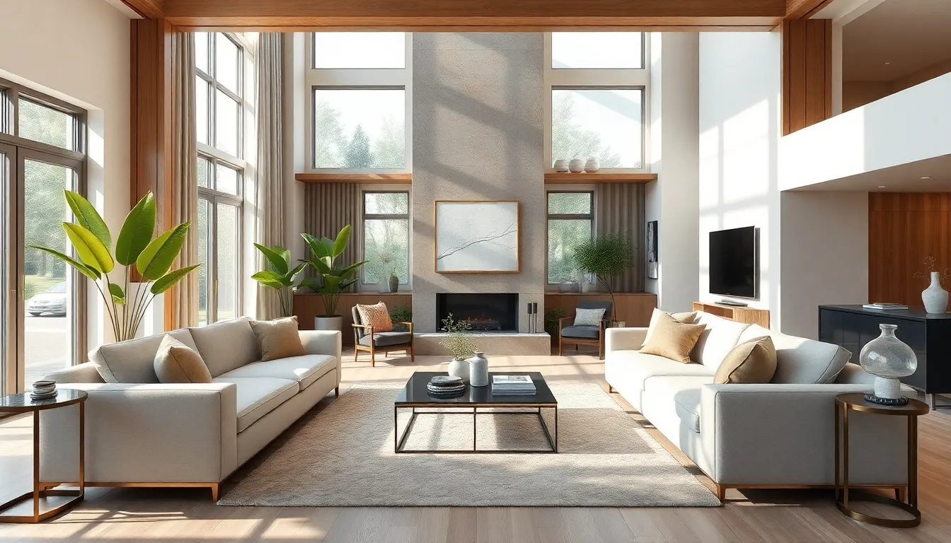
Social seating in 2023 is planned around conversation, not television viewing. The aim is simple: let guests see one another without twisting, shouting, or crossing the room. A well-composed layout feels generous, even when the floor area is modest.
Begin with the room’s social centre. Place a low table or compact ottoman where everyone can reach it, then arrange seats in an open square, soft semicircle, or facing pair. Keep the main walking route outside this group. A clearance of about 75 to 90 centimetres usually allows people to move through comfortably.
- Use two sofas at a right angle to create an intimate corner.
- Float a sofa away from the wall when the room permits it.
- Add one or two movable lounge chairs for changing guest numbers.
- Keep tables within roughly 45 centimetres of the nearest seat.
- Choose seat heights that differ only slightly, so conversation stays natural.
A double-sided sofa can divide a large room without closing it off. One side may face the fireplace, while the other serves a reading area or drinks table. This arrangement earns its space twice in open-plan homes.
Comfort needs more than soft upholstery. Check seat depth, back angle, arm height, and firmness before ordering. For relaxed conversation, a seat depth near 55 to 65 centimetres often works well. Very deep seating looks sumptuous, but shorter guests may struggle to sit upright.
Luxury also appears in the details guests touch: firm cushions, smooth edges, quiet casters, and side tables at elbow height. Add layered lighting with a central glow, adjustable floor lamps, and low table lamps so the room can shift from afternoon visits to a late dinner.
Irregular Rugs as Artistic Focal Points
Irregular rugs turn the floor into a composed visual statement. Their uneven outlines can define a zone without adding walls, which makes them useful in open-plan interiors and rooms with unusual architecture. The shape should respond to the furniture, not fight it.
Start with the seating footprint. A rug should extend beneath the front legs of the main chairs or sofa, while its contour can remain visible around the edges. For a lounge area, leave roughly 20 to 40 centimetres of rug beyond the furniture line where possible. This keeps the arrangement grounded and prevents the piece from looking undersized.
- Choose a curved edge to soften a room with many straight lines.
- Use an angular outline to echo architectural features or geometric artwork.
- Place the most distinctive curve where it can be seen from the room entrance.
- Keep door swings, vents, and cabinet openings clear.
- Use a non-slip pad, especially beneath lightweight or low-pile designs.
Material changes the effect. Hand-tufted wool offers a dense, resilient surface and works well in living areas. Viscose or bamboo silk creates a luminous finish, but it is less forgiving in busy walkways. In dining spaces, a tightly woven flatweave is easier to clean than a deep pile.
Proportion deserves close attention. A sculptural rug needs enough open floor around it to read as an artwork. If the room is narrow, an elongated organic shape may guide the eye along its length. In a square room, a rounded or asymmetrical design can break up rigid geometry.
Colour and pattern should support the outline. A bold graphic design may need calm upholstery nearby, while a quiet monochrome rug can carry a more intricate furniture arrangement. Before buying, mark the proposed shape with painter’s tape and walk around it for a day. The simple test catches awkward proportions quickly.
Natural Materials for a Calm, Refined Atmosphere
Natural materials bring luxury down to earth. Their value lies not only in appearance, but also in how they age, feel, and respond to daily use. In a refined interior, texture becomes part of the experience: a honed stone surface, woven fibre, or finely finished timber can make a room feel quietly considered.
Use material contrast to avoid a flat scheme. Combine coarse woven textile with smooth stone, or place a matte ceramic object beside a softly polished surface. Natural does not mean rustic; precise detailing can make these materials distinctly contemporary.
- Choose certified timber with a clear chain of custody where possible.
- Use linen and cotton for curtains, cushions, and relaxed upholstery.
- Select honed stone when you want a softer look with less glare.
- Add woven reed, rattan, or straw details in small, controlled areas.
- Prefer repairable materials and finishes that can be renewed over time.
Performance still matters. Untreated stone can absorb oils, while some natural fibres mark easily in high-use zones. Ask for care instructions, stain resistance, and repair options before specifying a material. A luxury finish should remain beautiful after breakfast, muddy shoes, and the occasional clumsy moment.
Material sourcing affects the environmental balance as well. Look for recycled content, local fabrication, low-emission adhesives, and suppliers who disclose origin. Certifications can help, but transport distance, expected lifespan, and maintenance also matter.
Keep the palette disciplined. Two or three principal materials are often enough for one room. Let their grain, weave, and mineral variation provide the drama. The result is calm, tactile, and more enduring than a surface chosen only because it photographs well.
Glass Elements for Light and Connected Spaces
Glass elements give luxury interiors a sense of flow. They can separate functions without blocking sight lines, making a compact plan feel less divided and a large one more coherent. The key is to select the right glass type for privacy, safety, and daylight control.
Use fluted or reeded glass when you want filtered views. Its vertical texture softens outlines while still passing light. Clear glass suits display partitions and internal doors, whereas acid-etched or sandblasted finishes offer stronger privacy. In bathrooms and bedrooms, translucent panels often provide a better balance than fully transparent screens.
- Choose laminated safety glass for doors, screens, and overhead applications.
- Use slim steel or timber frames to give large panes visual structure.
- Specify low-iron glass when colour clarity matters for art or cabinetry.
- Add curtains, blinds, or solar-control coatings on sun-facing elevations.
- Use acoustic laminated glass where a partition must reduce noise.
Standard double glazing typically has a lower insulating value than modern triple glazing, while low-emissivity coatings help reduce heat transfer. The final result depends on the frame, seals, orientation, and installation quality—not the pane alone.
Glass can support passive solar design. A south-facing window may bring useful winter warmth, but it can cause overheating in summer. External shading usually works better than internal blinds because it blocks solar energy before it reaches the room.
For a polished finish, align glass partitions with existing architectural lines. Hide bulky tracks where possible, use consistent hardware, and plan cleaning access from the start. Fingerprints, dust, and glare are not glamorous. Thoughtful detailing keeps transparency effortless rather than fussy.
Dark Wood for Character and Intimacy
Dark wood returns in 2023 with a more considered role. Rather than covering every surface, it works best as a visual anchor: a built-in cabinet, dining table, door, or single architectural wall. Its deeper tone gives pale rooms more weight and helps generous spaces feel composed.
Not all dark timber looks the same. Walnut has a softer brown cast and visible flowing grain. Smoked oak feels more graphic, while stained ash offers a consistent surface at a lower material cost. Always inspect a full-size sample; small swatches can hide knots, undertones, and variation.
- Use book-matched veneer for a formal, continuous grain pattern.
- Choose quarter-sawn boards when stability and straight grain matter.
- Specify a matte oil or low-sheen lacquer to reduce glare.
- Keep ventilation gaps around large cabinet fronts and panels.
- Ask for FSC or PEFC certification and documented timber origin.
Dark timber needs tonal balance, not necessarily pale walls. Terracotta, muted blue, clay, and soft green can bring out its brown undertones. A blackened finish creates a sharper, more architectural mood; reddish stains feel richer and more traditional. The finish should match the room’s natural light, because north-facing spaces can make brown wood appear almost charcoal.
In kitchens and bathrooms, moisture control is essential. Use sealed edges, suitable substrates, and ventilation that meets local building requirements. Veneer panels are often more stable than solid boards for wide cabinet doors, while solid wood remains valuable for handles, shelves, and crafted details.
Think of dark wood as a frame for daily rituals. A finely made writing desk, fluted wardrobe front, or timber-lined niche can make ordinary use feel more deliberate. Its appeal is not grandeur for its own sake, but a room with a little more gravity.
Modular Furniture for Flexible Luxury
Modular furniture makes luxury more adaptable. Its separate units can be rearranged, expanded, or replaced as a room changes. This suits city apartments, multipurpose homes, and interiors that support work, rest, and entertaining without permanent rebuilding.
Look beyond simple sectional sofas. Modular systems now include shelving, storage walls, media units, benches, and compact workstations. A strong design uses precise proportions and concealed connections, so flexibility does not make the room look temporary or improvised.
- Select modules that share a clear height, depth, or visual line.
- Check the dimensions of lifts, staircases, doors, and narrow hallways before ordering.
- Choose removable covers or replaceable panels for easier maintenance.
- Use lockable connectors when units will be moved often.
- Leave access to sockets, vents, windows, and service panels.
A modular plan can reduce waste. If one section becomes damaged, replacing that unit may be more practical than discarding the entire piece. Ask about spare parts, fabric availability, repair methods, and expected service life. These details reveal whether a system is genuinely durable or merely marketed as flexible.
For small rooms, vertical modules can increase storage without taking more floor space. In larger interiors, low units can divide functions while preserving a clear sightline. Keep at least one open zone in the composition; too many connected pieces can make even an expensive room feel dense.
Luxury comes from the fit. Choose tailored upholstery, carefully aligned seams, integrated lighting, and hardware that feels solid in the hand. A modular interior should change easily, but it should not look changeable.
Warm Retro Colors and Richer Moodier Shades
Warm retro colours give 2023 interiors a richer visual pulse. Think ochre, rust, tobacco, terracotta, dusty rose, olive, and muted mustard. These tones bring a gentle nod to the 1970s without turning the room into a period set. Clean lines and a measured palette keep the nostalgia current.
Deeper shades work best when their undertones are understood. A blue with a grey base feels calm, while one with a green base feels more botanical. Brown-red hues add warmth; plum and aubergine bring drama with less visual sharpness than pure black. Always test paint on several walls, since daylight can shift a colour by a mile.
- Use terracotta or ochre on a feature wall, alcove, or built-in niche.
- Balance saturated colours with chalky, low-sheen finishes.
- Repeat one hue in small objects to create a controlled visual link.
- Use a dark ceiling in rooms with generous height and strong daylight.
- Reserve the deepest tones for intimate zones, libraries, or evening rooms.
Colour scale matters. A dark wall can make a large room feel more focused, but it may reduce perceived brightness in a small north-facing space. In compact rooms, apply the richer shade below dado height or use it on cabinetry. This keeps the colour expressive without making the volume feel compressed.
For a polished scheme, build three levels: a dominant field colour, a supporting middle tone, and a small accent. A room with muted clay walls, faded olive textiles, and a small note of saffron has more nuance than one strong colour used everywhere.
Use sheen with care. Matte paint absorbs light and gives dark colours a velvety depth. Satin finishes highlight mouldings, doors, and joinery, but they also reveal surface flaws. Keep glossy surfaces limited to selected architectural details, where reflection can sharpen the composition.
Statement Ceilings and Pattern Drenching
In 2023, the fifth wall becomes a serious design surface. A painted ceiling, printed paper, or subtle architectural finish can alter the room’s proportions and create a more complete visual composition. This is especially effective in dining rooms, entrance halls, studies, and bedrooms, where a stronger atmosphere feels natural.
Choose the ceiling treatment according to room height. A pale pattern can add interest without lowering the visual volume. A darker ceiling creates intimacy in a tall room, while a colour close to the walls makes the boundaries feel less abrupt. Gloss paint reflects light, but it also shows flaws, so the plasterwork must be exceptionally smooth.
- Use wallpaper on the ceiling only after checking its weight and adhesion requirements.
- Repeat a ceiling colour in one textile or artwork, not across every surface.
- Keep ornate patterns away from busy architectural junctions.
- Use a border or cornice to create a clean transition between wall and ceiling.
- Plan lighting positions before decorating, especially for recessed fittings.
Pattern drenching takes a bolder route. One motif appears across several surfaces, such as walls, curtains, upholstery, and lampshades. The result can feel enveloping rather than chaotic when the pattern has a clear scale and the background colour remains consistent.
Scale is the main control. Large motifs suit generous rooms and wide walls. Smaller repeats work better in compact spaces, though they may become visually restless when used everywhere. Introduce plain areas through flooring, trim, or one unpatterned piece of furniture to provide breathing space.
Before committing, order full wallpaper samples and view them under daylight, evening lamps, and low winter light. Check pattern alignment at corners, window reveals, and door openings. Professional installation is worth considering for ceilings, where gravity, seams, and awkward angles can turn a lovely idea into a headache.
Curves, Wavy Details, and Playful Interior Features
Curved forms give a luxury interior a softer visual rhythm. In 2023, rounded silhouettes appear in sofas, tables, mirrors, lighting, and joinery, while scalloped or wavy edges add a playful note. Used with care, these shapes make a room feel expressive without relying on heavy ornament.
Mix curves with straight architectural lines for balance. A rounded coffee table can soften a rectilinear sofa, while an arched mirror can echo a doorway or window. Avoid placing too many identical arcs together; repetition should feel intentional, not like a showroom display.
- Use one dominant curved form and two smaller echoes.
- Choose oval tables to improve circulation in narrow rooms.
- Add a wavy edge to one shelf, console, or mirror for a controlled accent.
- Use rounded corners in children’s areas to reduce sharp contact points.
- Check cleaning access around sculptural shapes and narrow recesses.
Indoor swings bring the trend in a more tactile, unexpected direction. A suspended seat can work in a reading corner or private lounge, but it needs proper structural support. Fixing points must be assessed by a qualified professional, and the chair should have enough clear space to move without striking walls, furniture, or glazing.
Lighting can shape the effect. Opal globes, curved pendants, and wall lights with soft radii spread illumination more gently than exposed angular fittings. In a formal room, one rounded lamp may be enough to loosen the composition.
Keep playful elements useful. A scalloped headboard, curved banquette, or rounded storage niche adds personality while serving a clear purpose. Whimsy is most convincing when it earns its place.
Fazit: Create a Personal, Flexible, and Timeless Luxury Interior
A successful 2023 luxury interior is not a catalogue of fashionable objects. It is a carefully edited setting that supports the way you live today and can adapt to what comes next. The strongest design decisions connect beauty with practical use, emotional meaning, and responsible ownership.
Before making a major purchase, assess the room as a long-term system. Measure circulation, storage needs, maintenance demands, and access for future repairs. Ask whether each significant piece can be reupholstered, refinished, relocated, or passed on. This test separates lasting value from a short-lived visual effect.
Personal design also benefits from a clear hierarchy. Give priority to elements that shape daily life, such as lighting controls, acoustic comfort, storage, and ergonomic furniture. Then add distinctive pieces that carry memory or craft. The result feels individual because it reflects decisions, not because it contains more decoration.
- Set a realistic budget for installation, delivery, care, and future repairs.
- Record material specifications, dimensions, finishes, and warranty details.
- Choose timeless foundations and reserve experimental choices for replaceable elements.
- Review the plan from different viewpoints, including entrances and adjoining rooms.
- Keep a small reserve for custom adjustments after the space is in use.
Luxury should remain comfortable to inhabit and sensible to maintain. A room earns its future when it welcomes change without losing its identity. The best 2023 interiors are therefore not frozen snapshots, but thoughtful frameworks for living, gathering, and evolving.
Frequently Asked Questions About Luxury Interior Design Trends in 2023
What are the key luxury interior design trends for 2023?
The key trends include gold accents, dark wood, natural materials, flexible modular furniture, social seating arrangements, irregular rugs, glass elements, warm retro colours, statement ceilings, pattern drenching, mixed metals, curves, and biophilic design.
How can gold accents be used in a luxury interior without overwhelming the room?
Use gold selectively on details such as cabinet hardware, mirror frames, lighting, table legs, or decorative inlays. Repeating the finish two or three times and combining it with walnut, smoked glass, ivory, or deep green creates warmth and elegance without making the room feel excessive.
Why are dark woods becoming popular in luxury interior design?
Dark woods such as walnut add character, visual depth, and intimacy to a room. They create a more refined and grounded atmosphere, especially when paired with neutral tones, warm natural colours, gold accents, and carefully selected lighting.
How do modular furniture and social seating improve a luxury living space?
Modular furniture allows a room to adapt to changing needs, making it suitable for relaxing, working, and entertaining. Social seating arrangements place sofas and chairs around a shared centre so guests can interact comfortably while maintaining clear circulation through the room.
How do natural materials, glass, and biophilic design influence luxury interiors?
Natural materials such as wood, stone, linen, cotton, and woven fibres add tactile warmth and a connection to nature. Glass increases daylight and visual flow, while plants, organic shapes, natural colours, and generous windows support a calmer and more restorative living environment.