Table of Contents:
The Importance of Light Background Images in Design
Light background images play a crucial role in design, serving as a canvas that enhances the overall aesthetic and functionality of a project. They provide a subtle yet impactful way to create atmosphere, guide viewer attention, and establish brand identity. By choosing the right light background, designers can evoke specific emotions and set the tone for their work.
Here are some key reasons why light background images are essential in design:
- Visual Clarity: Light backgrounds tend to create a sense of space and openness. They allow other design elements, such as text and images, to stand out more effectively. This is particularly important in web design, where readability is paramount.
- Versatility: Light backgrounds can adapt to various styles and themes, whether for professional presentations, artistic projects, or casual designs. They serve as a neutral foundation that complements a wide range of colors and graphics.
- Emotional Influence: Colors and tones can significantly affect a viewer's emotions. Light backgrounds often convey feelings of calmness, friendliness, and approachability, making them ideal for brands aiming to connect with their audience on a personal level.
- Focus on Content: With a light background, the main content of a design can take center stage. This is especially useful for businesses that want to highlight key messages or products without overwhelming the viewer with competing visuals.
- Enhancing Brand Identity: Using consistent light background images across various platforms helps reinforce a brand's visual identity. It creates a cohesive look that can strengthen brand recognition and trust.
In conclusion, incorporating light background images into your designs is not just about aesthetics; it's about enhancing functionality and communicating effectively with your audience. Whether you're a freelance designer or part of a larger agency, understanding the importance of these backgrounds can elevate your projects and help you create more engaging visual experiences.
Types of Light Background Images Available
When it comes to light background images, designers can choose from a variety of types that cater to different project needs and aesthetic preferences. Here’s a breakdown of some popular categories available on platforms like Freepik:
- Bokeh: This type features a soft, out-of-focus light effect that adds depth and a dreamy quality to designs. It’s ideal for creating a warm, inviting atmosphere.
- Gradient: Gradient backgrounds transition smoothly between two or more colors, offering a modern and dynamic look. They can be used to convey movement and energy or to create subtle elegance.
- Monochrome: These backgrounds utilize varying shades of a single color, providing a clean and minimalist aesthetic. They are great for emphasizing content without distraction.
- Textured: Light backgrounds with subtle textures, like paper or fabric, can add visual interest while maintaining a soft appearance. This type is useful for designs that require a bit of warmth and character.
- Abstract: Abstract light backgrounds feature non-representational shapes and patterns, allowing for creative freedom. They can enhance a design’s uniqueness and evoke various emotions.
- Nature-Inspired: Images that include elements like soft skies, gentle water reflections, or light-filtering foliage create a serene and refreshing backdrop. These are perfect for projects aiming for a natural vibe.
Each type of light background image serves a distinct purpose and can significantly impact the overall feel of a design. By selecting the appropriate category, designers can enhance their projects, making them more engaging and visually appealing.
How to Choose the Right Light Background for Your Project
Choosing the right light background for your project involves a thoughtful consideration of various factors that can influence the design's effectiveness. Here are some essential steps to guide you through the selection process:
- Define Your Purpose: Before diving into options, clarify the purpose of your project. Are you creating a corporate presentation, a personal blog, or a marketing campaign? Understanding your goals will help narrow down suitable backgrounds.
- Consider Your Audience: Identify your target audience and their preferences. A light background that resonates with a professional audience may differ from one aimed at a younger demographic. Tailoring your choice to your audience can enhance engagement.
- Evaluate Color Schemes: Light backgrounds should complement your overall color palette. Use tools like color wheel applications to find harmonious combinations. Ensure that the background enhances rather than competes with other design elements.
- Assess Visual Hierarchy: Think about the content that will overlay your background. A background should support the visual hierarchy, allowing important elements to stand out. Test various backgrounds with your content to ensure readability and focus.
- Explore Texture and Patterns: Light backgrounds can include subtle textures or patterns that add depth without overwhelming the design. Experiment with different options to find a balance that enhances your project’s aesthetic.
- Test Across Devices: With varying screen sizes and resolutions, it’s vital to test how your selected background appears on different devices. Ensure that it maintains its effectiveness whether viewed on a desktop or mobile device.
By following these steps, you can confidently select a light background image that not only enhances your design but also aligns with your project goals and audience expectations.
Utilizing AI Image Generators for Custom Backgrounds
Utilizing AI image generators for custom backgrounds opens up a world of creative possibilities for designers. These tools allow you to create unique, tailored light backgrounds that perfectly fit the theme and requirements of your projects. Here’s how you can effectively leverage AI image generators:
- Customization: AI generators enable you to specify your desired attributes such as color schemes, styles, and textures. This means you can create backgrounds that align with your specific vision rather than relying solely on pre-existing images.
- Experimentation: With AI tools, you can quickly generate multiple variations of a background. This experimentation can lead to surprising and innovative designs, allowing you to discover combinations you might not have considered otherwise.
- Time Efficiency: Generating backgrounds using AI can be significantly faster than traditional design methods. This efficiency allows designers to focus on other critical aspects of their projects while still obtaining high-quality images.
- Unique Results: Since AI generates images based on algorithms and machine learning, the backgrounds produced are often one-of-a-kind. This uniqueness can set your designs apart in a crowded market.
- Integration with Other Tools: Many AI image generators can be integrated with design software, making it easy to import and adjust the generated backgrounds within your existing workflow.
- Cost-Effectiveness: Some AI image generation tools are available for free or at a low cost, making them accessible for designers on a budget. This affordability allows for experimentation without significant financial investment.
Incorporating AI-generated backgrounds into your projects not only enhances creativity but also provides a fresh approach to design. By exploring these tools, you can create stunning, customized light backgrounds that elevate your work and engage your audience effectively.
Exploring Categories: Bokeh, Gradient, and Monochrome
When exploring light background images on platforms like Freepik, three popular categories stand out: Bokeh, Gradient, and Monochrome. Each of these categories offers unique visual characteristics that can enhance various design projects.
- Bokeh: This category is characterized by its soft, blurred light effects, which create a dreamy and ethereal quality. Bokeh backgrounds are perfect for adding depth to images and can be used to draw attention to foreground elements. They are particularly effective in photography and digital artwork where a gentle, romantic atmosphere is desired. Designers can use bokeh backgrounds to create warmth and invite engagement in their projects.
- Gradient: Gradient backgrounds feature a smooth transition between colors, adding dynamism and modernity to designs. They can range from subtle fades to bold contrasts, making them versatile for various applications. Gradients are excellent for creating depth and dimension, and they can evoke different moods depending on the color choices. Designers often use gradients to provide a contemporary look, making them suitable for websites, posters, and branding materials.
- Monochrome: Monochrome backgrounds utilize variations of a single color, which can range from light pastels to deep hues. This simplicity allows for a clean and sophisticated aesthetic, making them ideal for minimalistic designs. Monochrome backgrounds can help establish a cohesive look across various elements, ensuring that text and images remain prominent. They are particularly useful in corporate branding and professional presentations, where clarity and focus are paramount.
By understanding the distinct qualities of Bokeh, Gradient, and Monochrome backgrounds, designers can make informed choices that enhance their projects and resonate with their target audience. Each category provides a unique opportunity to express creativity while maintaining a cohesive design approach.
Tips for Effective Use of Light Backgrounds in Designs
Using light backgrounds effectively in your designs can significantly enhance the visual appeal and functionality of your projects. Here are some tips to ensure that your light backgrounds contribute positively to your overall design:
- Layering Elements: When using light backgrounds, consider layering different design elements to create depth. This can involve adding shadows or outlines to text and images to ensure they stand out against the background.
- Contrast Matters: Pay attention to the contrast between your background and foreground elements. High contrast can help important information pop, while low contrast may result in a more subtle, harmonious design. Experiment with different color combinations to find the right balance.
- Whitespace Utilization: Light backgrounds are excellent for incorporating whitespace, which helps to create a clean, uncluttered look. Use whitespace strategically to guide the viewer’s eye to key content and improve overall readability.
- Responsive Design: Ensure that your light background looks good across various devices and screen sizes. Test your designs on mobile and desktop to confirm that the background maintains its effectiveness and does not lose clarity.
- Emphasize Brand Identity: Choose light backgrounds that align with your brand’s color palette and identity. Consistency in background choice can reinforce brand recognition and create a cohesive look across different platforms.
- Use Subtle Patterns: If a plain light background feels too simplistic, consider using subtle patterns or textures. This can add visual interest without overwhelming the viewer. Ensure that these patterns are light enough not to distract from the main content.
By applying these tips, you can maximize the effectiveness of light backgrounds in your designs, creating engaging and visually appealing projects that resonate with your audience.
Navigating Freepik: Finding the Perfect Light Background
Navigating Freepik to find the perfect light background is an intuitive process, thanks to its user-friendly interface and extensive library. Here are some strategies to help you effectively explore and select the ideal backgrounds for your projects:
- Utilize the Search Bar: Start by entering specific keywords related to the type of light background you’re looking for, such as "light bokeh" or "gradient background." This targeted approach can yield more relevant results quickly.
- Explore Categories: Freepik categorizes images into various sections. Check out the 'Backgrounds' category to find collections of light backgrounds, or explore subcategories to narrow your search based on style, such as 'Nature' or 'Abstract.'
- Apply Filters: Use filters to refine your search results. You can filter by orientation (horizontal or vertical), color, and even by file type (e.g., PSD, PNG). This helps in narrowing down options that best fit your design needs.
- Check Premium Options: While Freepik offers a plethora of free backgrounds, consider exploring premium options as well. These often come with enhanced quality and exclusivity, which can be beneficial for professional projects.
- Preview Images: Before downloading, take advantage of the preview feature to see how the background looks in detail. This can help you assess the quality and suitability of the image for your specific design.
- Save Favorites: If you come across multiple backgrounds that you like, use the 'Favorites' feature. This allows you to compile a list of potential backgrounds for easy access later, making your final selection process smoother.
By following these tips, you can efficiently navigate Freepik and discover light background images that perfectly complement your design projects, enhancing both their aesthetic appeal and functionality.
Incorporating Light Backgrounds in Business Applications
Incorporating light backgrounds into business applications can significantly enhance communication and branding efforts. Here are several ways to effectively use light backgrounds in various business contexts:
- Presentations: Light backgrounds can improve readability and keep the audience focused on the content. They create a professional look that enhances the overall aesthetic of slides, making it easier for viewers to absorb information.
- Marketing Materials: Whether for brochures, flyers, or digital ads, light backgrounds can draw attention to key messages and graphics. They help in conveying a clean and polished image, which can positively influence customer perception.
- Web Design: A light background on websites can enhance user experience by providing a spacious and inviting feel. It allows text and images to stand out, improving navigation and engagement on the site.
- Social Media Graphics: When designing posts or advertisements for social media, light backgrounds can help maintain brand consistency and increase visual appeal. They can make graphics more shareable and eye-catching in crowded feeds.
- Brand Identity: Consistent use of light backgrounds across all business materials reinforces brand identity. It creates a cohesive look that helps establish recognition and trust among clients and customers.
- Reports and Proposals: Using light backgrounds in professional documents can make them more visually appealing and easier to read. This approach can enhance the professionalism of reports and proposals, making them more persuasive.
By strategically incorporating light backgrounds in business applications, companies can create a more engaging and effective visual communication strategy. This not only enhances the aesthetic appeal of their materials but also improves the clarity and impact of their messages.
Creating Unique Designs with Light Backgrounds
Creating unique designs with light backgrounds involves a blend of creativity, strategic thinking, and an understanding of visual aesthetics. Here are some effective approaches to help you harness the potential of light backgrounds in your designs:
- Combine with Vibrant Elements: Light backgrounds serve as a canvas for more vibrant elements. Use bold colors and intricate patterns as overlays to create striking contrasts that capture attention.
- Utilize Layering Techniques: Experiment with layering different elements, such as text, images, and graphics, over a light background. This adds depth and dimension, making your design feel more dynamic and engaging.
- Incorporate Branding Elements: Ensure that your light background aligns with your brand's identity. Use brand colors and logos subtly within the design to reinforce recognition while maintaining a clean look.
- Experiment with Typography: The choice of typography can dramatically affect the overall design. Use stylish fonts that contrast well with your light background to create visual interest and improve readability.
- Focus on Visual Storytelling: Use your light background to set the stage for a narrative. Whether through imagery or text, guide the viewer's eye and convey a story that resonates with your audience.
- Test Different Compositions: Don’t hesitate to try various compositions and layouts. A unique arrangement of elements can lead to innovative designs that stand out and leave a lasting impression.
By applying these strategies, designers can create unique and compelling visuals that leverage the strengths of light backgrounds. This not only enhances the aesthetic appeal but also fosters a stronger connection with the audience.
The Role of Color in Light Background Design
The role of color in light background design is pivotal as it influences both the aesthetics and functionality of a project. Selecting the right colors can enhance mood, attract attention, and reinforce brand identity. Here are some key considerations regarding color in light background design:
- Emotional Resonance: Different colors evoke various emotions. For example, light blues can convey tranquility, while soft yellows might evoke cheerfulness. Understanding color psychology can help in choosing backgrounds that resonate with your audience's feelings.
- Color Harmony: A harmonious color palette is essential for creating visually appealing designs. Light backgrounds can serve as a neutral base, allowing other colors to shine. Use tools like color wheels to find complementary or analogous colors that work well together.
- Brand Alignment: Colors should reflect your brand's identity. Consistent use of brand colors in light backgrounds helps reinforce recognition and trust. This alignment is crucial in business applications where brand loyalty is essential.
- Contrast and Readability: Ensure sufficient contrast between the background and foreground elements. Light backgrounds can make darker text pop, improving readability. Testing combinations is vital to achieving the best visual results.
- Subtle Variations: Even within light backgrounds, subtle variations in color can add depth and interest. For instance, a gradient effect or a very soft texture can make a light background more dynamic without overwhelming the design.
- Trends and Styles: Stay updated on color trends and styles to keep your designs fresh and relevant. Popular palettes can change over time, so being aware of current trends can enhance the appeal of your projects.
By thoughtfully considering the role of color in light background design, you can create visually stunning and effective designs that engage your audience and communicate your message clearly.
Enhancing Visual Appeal with Light Backgrounds
Enhancing visual appeal with light backgrounds can significantly transform the overall impact of a design. These backgrounds serve as a foundation that can elevate content, draw attention, and create a cohesive look across various projects. Here are some effective strategies to enhance visual appeal using light backgrounds:
- Use of Space: Light backgrounds can create an illusion of more space, making designs feel airy and open. This spaciousness allows for better organization of content and can lead to a more pleasant viewing experience.
- Complementary Colors: Pairing light backgrounds with complementary colors can create striking contrasts that make design elements pop. For instance, darker fonts or vivid graphics can stand out beautifully against a soft background, improving visibility and engagement.
- Incorporating Imagery: Light backgrounds can effectively showcase images, allowing them to take center stage. High-quality visuals combined with a light backdrop can create a sophisticated and polished look, drawing the viewer’s eye to the focal points.
- Dynamic Textures: Adding subtle textures to light backgrounds can enhance depth and interest without overwhelming the viewer. Textured backgrounds can provide a tactile quality that enhances the overall design while maintaining a light and airy feel.
- Brand Storytelling: Light backgrounds can be utilized to convey brand stories effectively. By integrating brand elements and narratives within these backgrounds, designers can create a more immersive experience that resonates with the audience.
- Seasonal Themes: Light backgrounds can be adapted for seasonal designs, reflecting different moods and themes throughout the year. For example, pastel colors for spring or light blues for summer can invoke the essence of each season.
By implementing these strategies, designers can enhance the visual appeal of their projects through the effective use of light backgrounds, ensuring that their designs are not only aesthetically pleasing but also impactful and engaging.
Examples of Successful Designs Using Light Backgrounds
Examples of successful designs using light backgrounds demonstrate the versatility and effectiveness of these elements across various applications. Here are some notable instances where light backgrounds have been effectively utilized:
- Corporate Presentations: Many businesses use light backgrounds in PowerPoint presentations to maintain professionalism while ensuring that their key messages are easily readable. The combination of light colors with dark text helps to engage the audience without causing eye strain.
- Website Designs: Websites that employ light backgrounds often create a clean and user-friendly interface. For instance, e-commerce sites frequently use light backgrounds to highlight product images, allowing potential customers to focus on the items without distractions.
- Social Media Campaigns: Brands have successfully launched social media campaigns with light background graphics that feature vibrant product images. This approach makes posts more appealing and shareable, increasing user engagement and brand visibility.
- Print Marketing Materials: Flyers and brochures designed with light backgrounds often look more inviting. For example, a travel agency may use light, airy backgrounds to evoke feelings of relaxation and adventure, making the promotional material more enticing.
- Event Invitations: Light backgrounds are popular in event invitations, especially for weddings and formal gatherings. The soft aesthetic of light backgrounds complements elegant typography and decorative elements, setting a pleasant tone for the occasion.
- Infographics: Light backgrounds in infographics can enhance readability and allow complex data to be presented clearly. By using light colors, designers can ensure that charts and graphs stand out, making information easier to digest.
These examples illustrate how light backgrounds can enhance the effectiveness of various designs, making them visually appealing and functional. By adopting similar strategies, designers can create engaging and impactful projects that resonate with their intended audience.
Accessing Free and Premium Light Background Downloads
Accessing free and premium light background downloads on Freepik is straightforward and designed to cater to a wide range of user needs. Here’s how you can navigate the platform to find the perfect backgrounds for your projects:
- Free Downloads: Freepik offers a vast selection of light background images available for free download. To access these, simply use the search bar to find specific backgrounds, then filter the results by selecting the "Free" option. This allows you to explore a plethora of choices without any cost.
- Premium Downloads: For users seeking higher quality or exclusive designs, Freepik provides premium downloads. A subscription plan grants access to an extensive library of premium light backgrounds. This option is ideal for designers who require unique resources for commercial projects.
- Account Creation: While browsing for backgrounds, creating a Freepik account can enhance your experience. An account allows you to save your favorite images, access download history, and benefit from personalized recommendations based on your interests.
- AI Image Generator: For those looking to create custom backgrounds, Freepik’s AI image generator is a valuable tool. This feature enables you to input specific criteria, resulting in unique light backgrounds tailored to your design needs.
- Search and Filter Options: Utilize Freepik’s advanced search and filter functions to streamline your search. You can filter by color, style, or specific themes such as "Bokeh" or "Gradient," making it easier to find backgrounds that fit your project’s requirements.
- Licensing Information: Always check the licensing agreements associated with each background. Freepik provides clear guidelines on usage rights, ensuring that you can use the images appropriately for both personal and commercial projects.
By leveraging these features, you can efficiently access a wide range of free and premium light background downloads on Freepik, enhancing your design projects with high-quality visuals.
User-Friendly Features for Designers on Freepik
Freepik offers several user-friendly features designed specifically for designers, enhancing the overall experience when searching for light background images. Here are some noteworthy aspects:
- Intuitive Interface: The platform boasts an easy-to-navigate layout, making it simple for users to find the desired images without unnecessary complications. The clean design ensures that even beginners can quickly become familiar with the site.
- Advanced Search Filters: Freepik provides robust filtering options that allow users to refine their searches based on specific criteria, such as color, orientation, and style. This functionality helps designers quickly locate the perfect light background that meets their project needs.
- Image Preview Options: Users can preview images in detail before downloading, allowing them to assess quality and suitability for their designs. This feature is particularly beneficial for ensuring that the chosen background fits well with other design elements.
- Collections and Curated Content: Freepik curates collections of images based on themes and styles, making it easier for designers to discover related backgrounds and graphics that work well together. This organizational strategy can inspire creativity and streamline the design process.
- Download Flexibility: The platform allows users to download images in various formats, such as SVG, PNG, and PSD. This flexibility ensures compatibility with different design software and workflows, catering to diverse user preferences.
- Community and Support: Freepik fosters a community where users can share tips, ask questions, and gain insights from one another. The availability of customer support further enhances the user experience, providing assistance when needed.
These features collectively make Freepik a valuable resource for designers, allowing them to efficiently access and utilize light background images in their creative projects.
Maximizing Your Creative Potential with Light Backgrounds
Maximizing your creative potential with light backgrounds involves leveraging their unique qualities to enhance your design projects. Here are some strategies to help you fully utilize light backgrounds in your work:
- Embrace Versatility: Light backgrounds are adaptable across various design types, from digital media to print. Use them in different contexts to see how they can transform your work, whether it's a website, a marketing brochure, or social media graphics.
- Experiment with Combinations: Pair light backgrounds with contrasting elements like vibrant colors or bold typography. This contrast can create striking visuals that capture attention and convey your message more effectively.
- Utilize Layers: Incorporate multiple layers in your design by adding textures or patterns over light backgrounds. This technique adds depth and interest, making your designs more dynamic and engaging.
- Leverage AI Tools: Use Freepik's AI Image Generator to create custom light backgrounds tailored to your specific needs. This can help you achieve a unique look that stands out and aligns with your creative vision.
- Focus on Storytelling: Use light backgrounds to support the narrative of your design. They can help set the mood and context, making your message more relatable and impactful to the audience.
- Stay Inspired: Regularly browse Freepik’s extensive library of light backgrounds for inspiration. Observing how other designers use light backgrounds can spark new ideas and techniques for your projects.
By implementing these strategies, you can enhance your creative process and maximize the potential of light backgrounds in your designs, ultimately leading to more compelling and visually appealing outcomes.
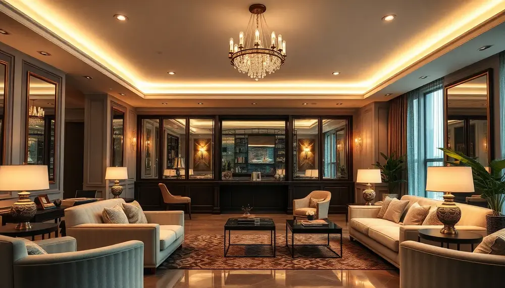
FAQ About Lighting Design Essentials
What are the key elements of effective lighting design?
The key elements of effective lighting design include the purpose of the space, the types of lighting (ambient, task, and accent), color temperature, fixture placement, and control systems.
How does lighting influence mood and ambiance?
Lighting significantly influences mood and ambiance by affecting how colors are perceived and the overall atmosphere of a space. Warm lighting can create a cozy feel, while cooler lighting often feels more energetic and modern.
What is the difference between ambient and task lighting?
Ambient lighting provides overall illumination for a space and sets the foundation for other types of lighting, while task lighting is designed to illuminate specific areas for activities like reading, cooking, or working.
How can I choose the right color temperature for my lighting?
Choosing the right color temperature depends on the desired atmosphere. Warmer tones (2700K-3000K) are ideal for cozy environments, while cooler tones (4000K-5000K) work well for more energetic spaces like offices.
What role do fixtures play in lighting design?
Fixtures play a crucial role in lighting design by determining the direction, intensity, and distribution of light. The choice of fixture affects the aesthetic of the space and the effectiveness of the lighting scheme.