Table of Contents:
Defining Your Design Vision: Styles, Philosophies, and Aesthetic Directions
Before you purchase a single piece of furniture or apply one coat of paint, you need to articulate what you actually want your space to feel like. Most design projects fail not because of budget constraints or poor execution, but because the homeowner never defined a coherent visual language from the start. The result is a room that looks assembled rather than designed — a collection of individual purchases rather than a unified environment.
Understanding the Spectrum of Design Philosophies
Interior design styles exist on a spectrum from maximalist to minimalist, from historically rooted to entirely contemporary. Maximalism — characterized by layered textiles, bold pattern mixing, and dense object arrangements — demands confident curation. Minimalism, by contrast, operates on the principle that every element must earn its presence. Neither approach is inherently superior, but attempting to blend them without a clear hierarchy creates visual noise. If you're drawn to both, establish a ratio: for example, a predominantly minimal structure with maximalist accent zones limited to one wall or surface.
Style taxonomies like Scandinavian, Mid-Century Modern, Industrial, or Japandi are useful shorthand, but treating them as rigid rulebooks is a mistake. The most compelling interiors borrow deliberately from multiple traditions. When exploring how to reimagine a room through intentional design choices, the key differentiator is always specificity — not just "modern," but which decade, which country, which material palette.
Identifying Your Core Aesthetic Drivers
A practical method for crystallizing your vision is to analyze your collected references and identify the underlying sensory qualities they share. Are you consistently drawn to matte surfaces or glossy finishes? High contrast or tonal harmony? Organic, irregular forms or precise geometric lines? These sensory preferences reveal your design DNA far more reliably than style labels do. Collect 20–30 images you genuinely love, then strip away the specific objects — what remains in terms of light, texture, and spatial quality is your actual vision.
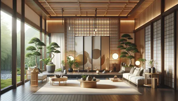
For those drawn to stillness and psychological comfort in their spaces, the principles behind designing a room with a calm, meditative atmosphere offer a masterclass in restraint. The Zen approach — built on negative space, natural materials, and deliberate imperfection — applies even if you're not pursuing a strictly Japanese aesthetic. Its core principle, that visual simplicity reduces cognitive load, is grounded in environmental psychology research.
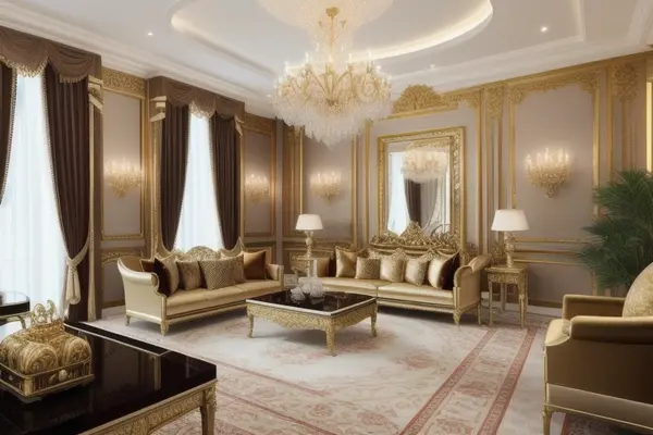
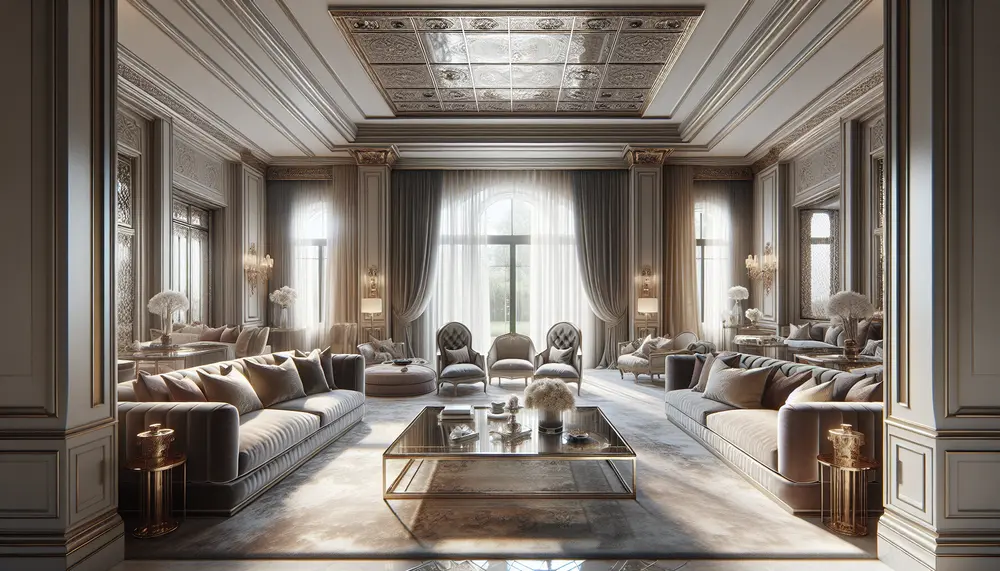
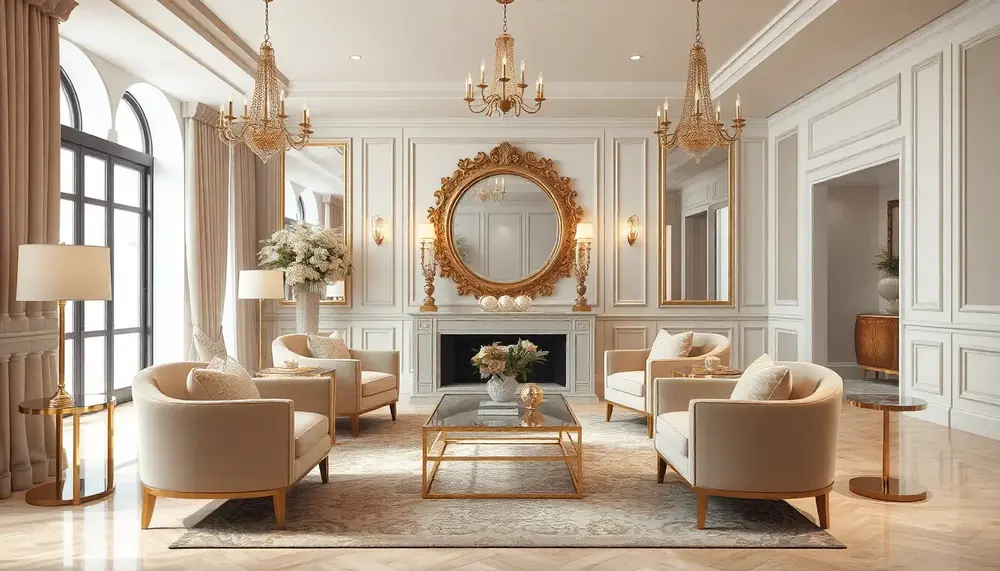
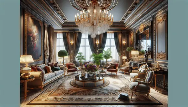
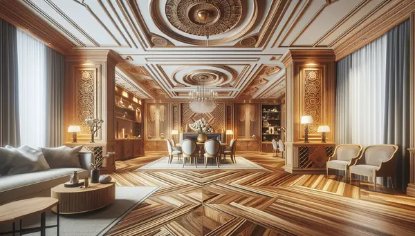
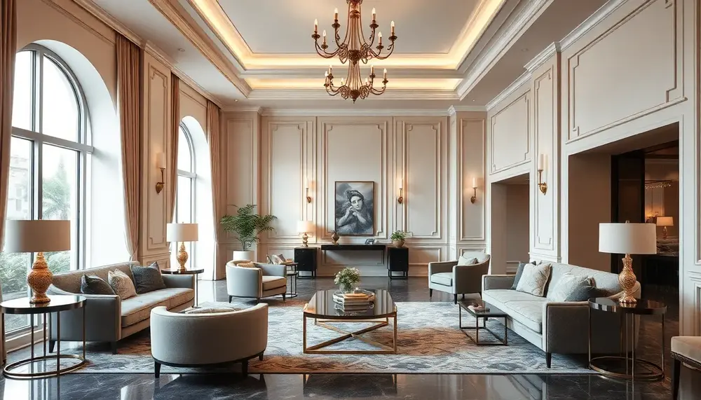
At the opposite end of the spectrum, luxury and glamour-driven design requires a different kind of discipline. Opulence without cohesion reads as excess rather than elegance. The difference between a room that feels genuinely sophisticated and one that simply looks expensive comes down to proportion and restraint. Studying the approach behind high-end residential design that prioritizes refined detail reveals that the wealthiest interiors typically employ a tightly controlled color palette — often no more than three tones — with complexity delivered through material variation rather than color saturation.
Whether your direction leans toward understated refinement or full richly layered, statement-making interiors, your starting point must always be a written brief — even a single paragraph — that describes the mood, function, and emotional experience you're designing toward. Without this anchor, every subsequent decision becomes arbitrary, and the room will show it.
- Define your style ratio before sourcing any items — e.g., 70% minimalist structure, 30% warm maximalist layering
- Identify 3 non-negotiable sensory qualities your space must have (warmth, drama, airiness, etc.)
- Write a one-paragraph mood brief referencing light quality, emotional tone, and intended use pattern
- Audit reference images for recurring material types — wood, stone, metal, textile — not just visual style
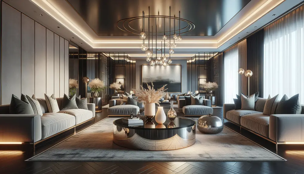
Living Room Transformations: From Layout Strategy to Statement Pieces
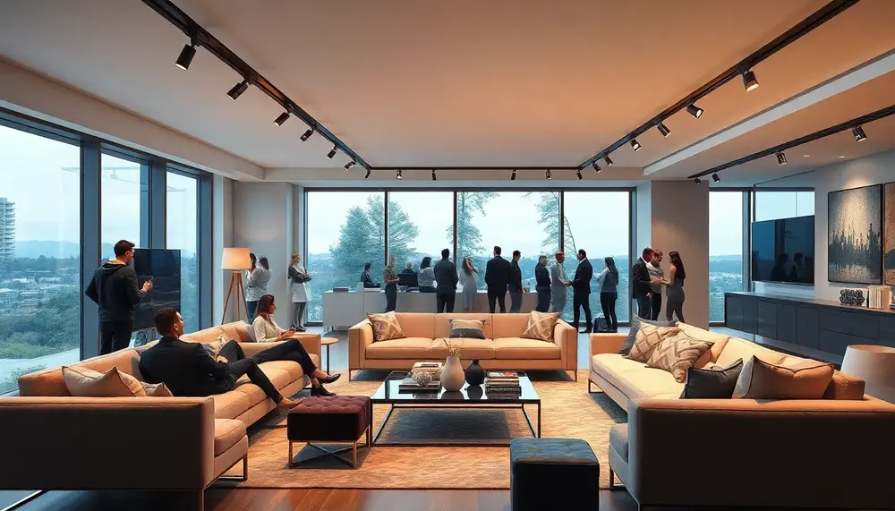
The living room is the single space in your home that has to perform the most roles simultaneously — hosting, relaxing, entertaining, and sometimes even working. Most failed redesigns share one root cause: jumping straight to furniture selection before establishing a functional layout. Measure your room precisely, mark traffic corridors (ideally 36 inches minimum for primary pathways), and define your conversation zone before a single piece of furniture enters the equation.
Anchoring the Space: Layout Principles That Actually Work
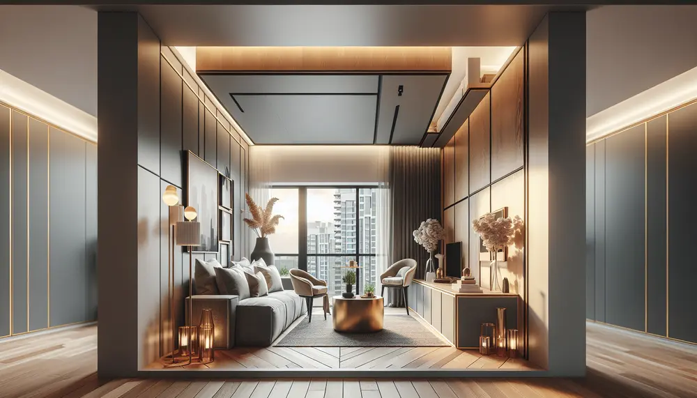
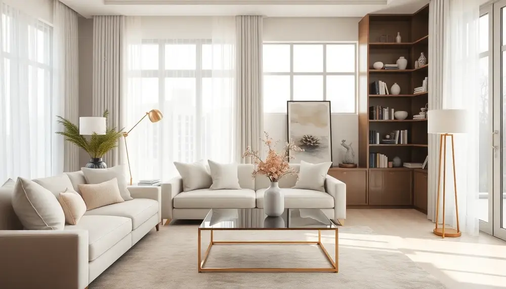
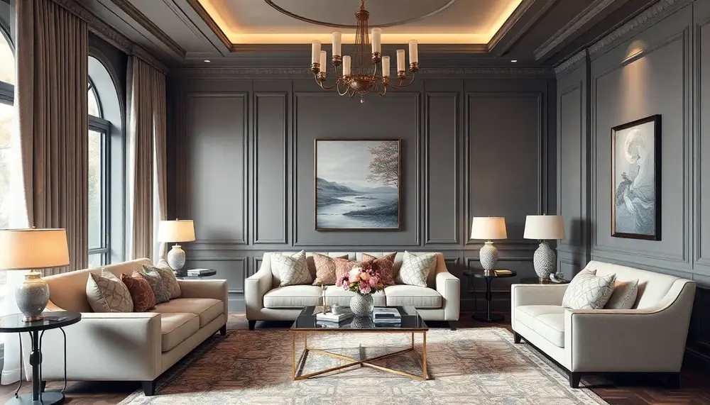
The most common layout mistake is pushing all furniture against the walls — a habit that makes rooms feel hollow rather than spacious. Instead, float your sofa 12 to 18 inches away from the wall to create depth and draw people into the room's center. A sectional in an L-configuration works particularly well in rooms between 200 and 350 square feet, because it defines the seating area without requiring additional accent chairs to complete the grouping. For rooms with awkward proportions — long and narrow being the most frequent — break the space into two distinct functional zones using a console table or a low open bookshelf as a soft divider.
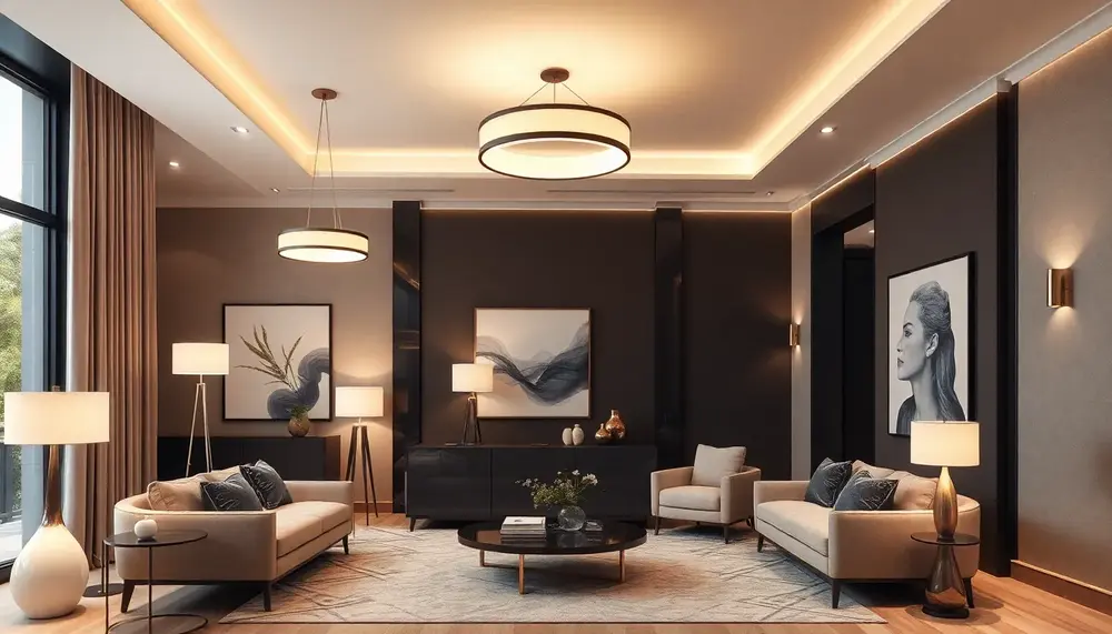
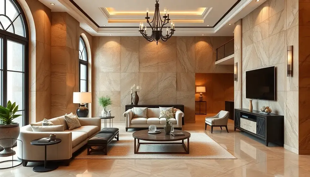
If you're working toward a more elevated aesthetic, studying how professionals approach high-end residential living spaces reveals consistent principles: a focal point anchoring one wall, symmetrical balance on either side, and a deliberate layering of textures across soft furnishings, hard surfaces, and decor objects. These aren't luxury-only rules — they translate directly into any budget.
Statement Pieces and Material Choices That Define the Room
A true statement piece doesn't mean the most expensive item — it means the one element the eye travels to first and last. This could be an oversized abstract canvas, a curved sculptural sofa in a bold upholstery, or a custom coffee table in solid walnut. Speaking of material choices, wood remains one of the most reliable anchors in residential interiors. The warmth and grain variation it introduces balances out the cooler tones of concrete, stone, and metal that dominate contemporary design — something explored in depth when examining how timber elements bring lasting character to interior spaces.
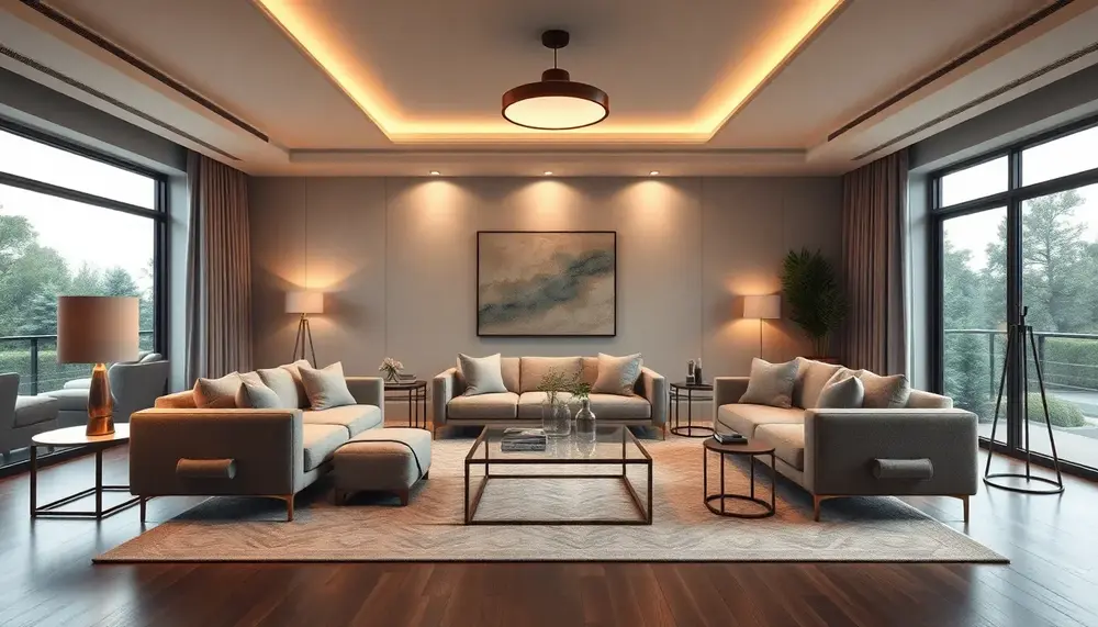
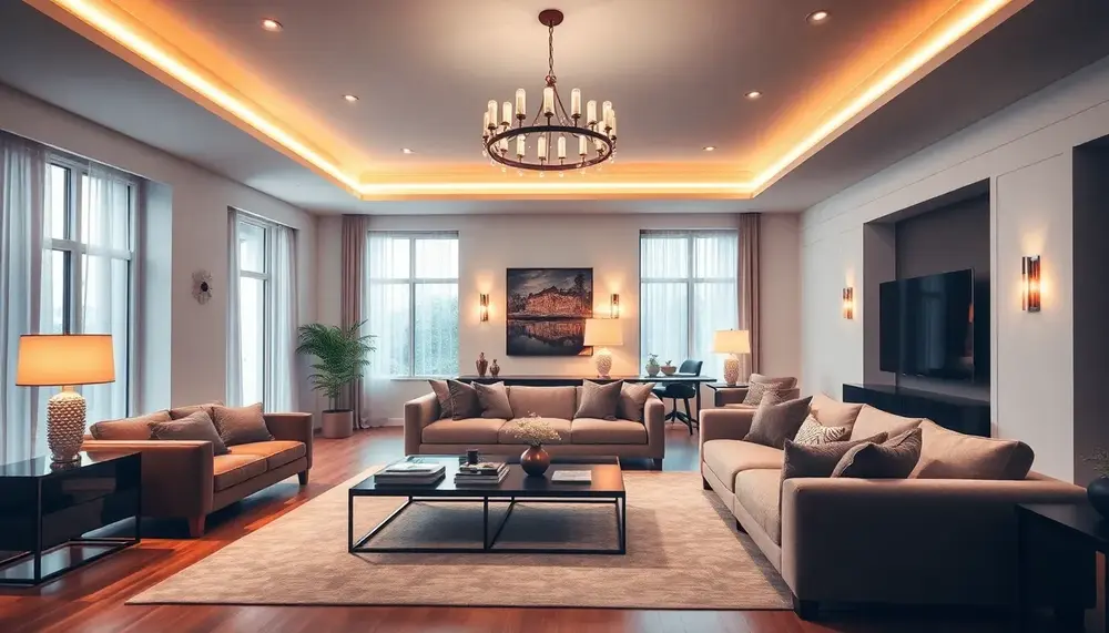
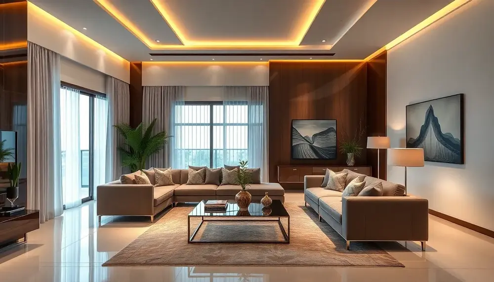
Lighting is where most living room transformations stall. Overhead recessed lighting alone creates a flat, office-like quality that no furniture arrangement can fully counteract. A properly layered approach includes:
- Ambient lighting — dimmable overhead or cove lighting setting the room's base tone
- Task lighting — floor lamps positioned beside reading chairs, minimum 58 to 64 inches tall
- Accent lighting — picture lights, LED strips behind shelving, or uplighters near plants
For practical starting points, current approaches to living room illumination show how even a modest budget can achieve dramatic results through fixture placement rather than expensive equipment. The ceiling fixture swap alone — replacing a builder-grade flush mount with a statement pendant or chandelier — delivers one of the highest visual returns per dollar of any single change. If you want to take the full approach, using lighting intentionally as a design tool rather than a utility solution is what separates professionally designed rooms from well-intentioned DIY ones.
Textiles close the loop. Layering a low-pile area rug over a jute base rug, adding linen throw pillows in two or three tones pulled from your dominant wall color, and draping a woven throw over one sofa arm introduces the tactile complexity that photographs beautifully and — more importantly — makes a room feel genuinely livable rather than staged.
Kitchen and Dining Room Design: Balancing Function, Materials, and Atmosphere
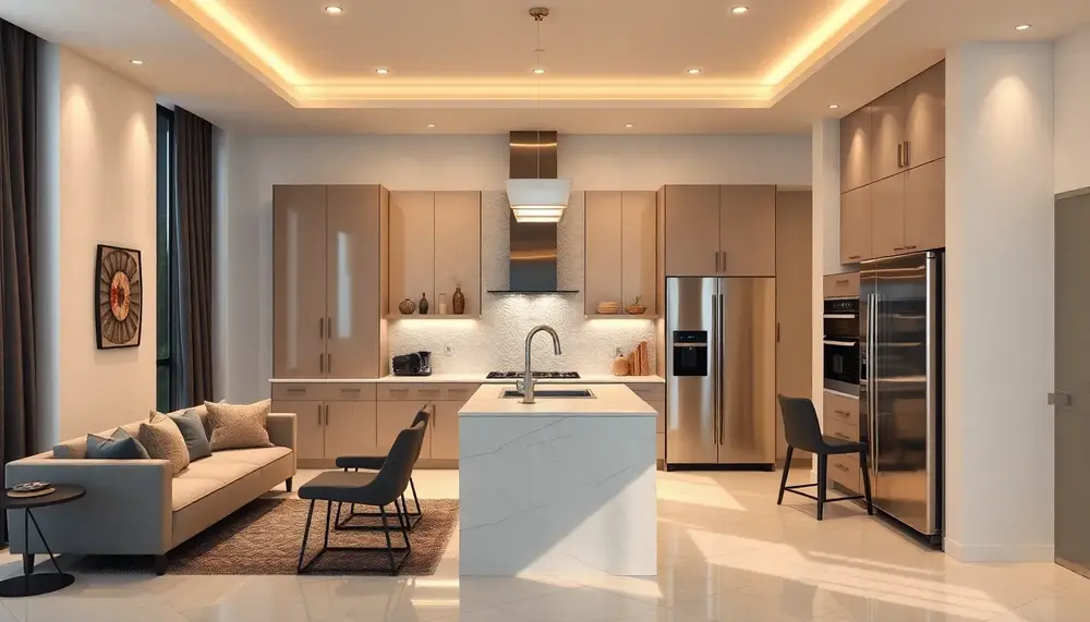
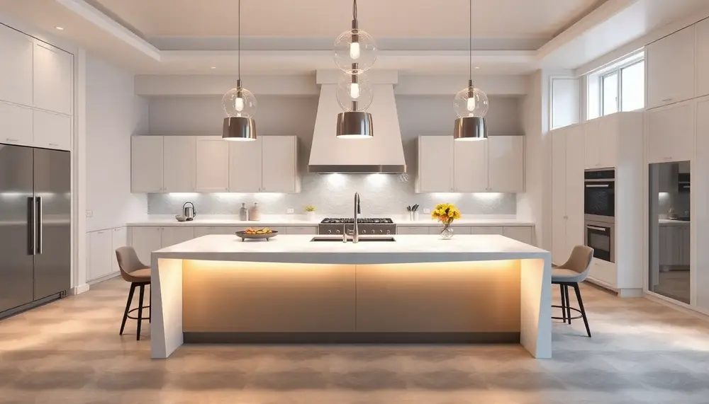
The kitchen and dining room represent two of the most demanding design challenges in any home — spaces where ergonomic precision must coexist with genuine warmth and visual identity. Unlike living rooms, where aesthetics can often lead decisions, these rooms operate under strict functional constraints: workflow triangles, ventilation requirements, surface durability, and acoustic comfort all compete for priority. Getting this balance right separates a kitchen that looks good in photographs from one that performs beautifully for a decade or more.
Material selection carries outsized importance here. A honed Calacatta marble countertop may photograph beautifully, but in a working kitchen it will stain from red wine within months without rigorous sealing and maintenance. Quartz composites — particularly brands like Silestone or Dekton — offer 93–94% stone composition with dramatically better resistance to acids and heat, making them the practical choice for serious cooks. Cabinet finishes tell a similar story: lacquered doors in high-traffic kitchens show fingerprints and micro-scratches within two years, while matte thermofoil or solid wood with an oil finish ages far more gracefully.
Turning the Kitchen into a Considered Environment
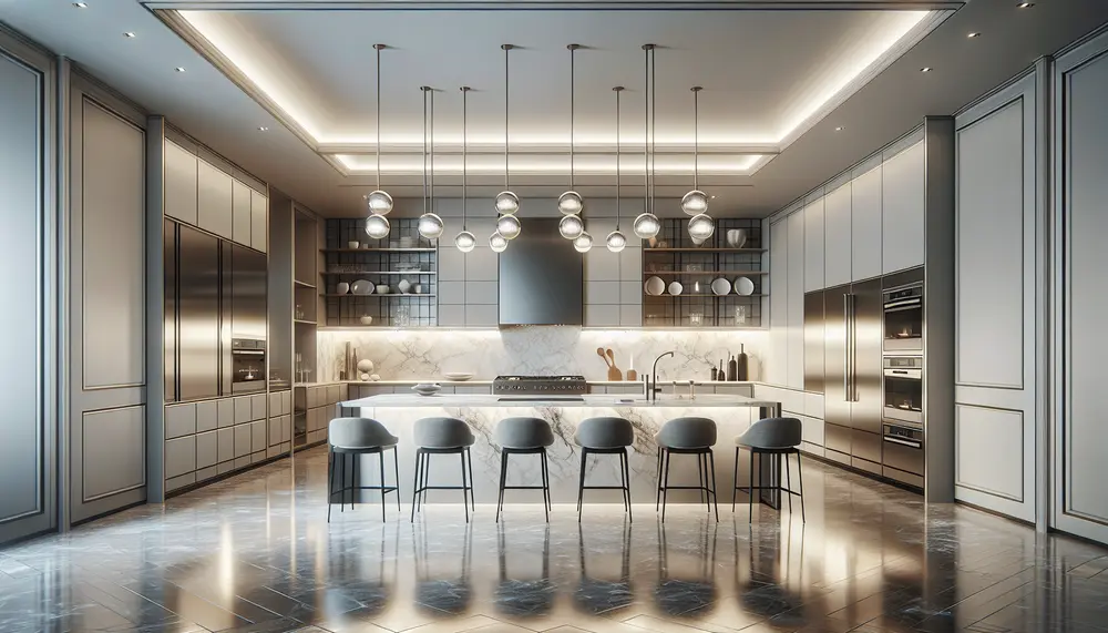
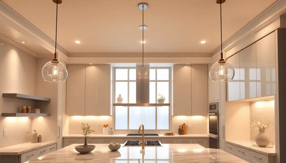
The most enduring kitchens are built around a clear design philosophy rather than trend-chasing. If you want to elevate your kitchen into something that feels genuinely luxurious, the investment should focus on three elements: hardware quality (solid brass or stainless pulls that won't corrode or loosen), integrated appliances that reduce visual noise, and layered lighting with at least three independent circuits. Recess lighting alone flattens a kitchen and creates harsh shadows on work surfaces — pair it with under-cabinet task lighting (minimum 400 lumens per linear meter) and ambient sources at lower levels.
Island design has evolved far beyond a simple prep surface. A well-proportioned island — typically 900–1000mm in height for standing prep work — can house a second sink, induction zones, and concealed storage while serving as the room's visual anchor. Pendant lighting above kitchen islands deserves particular attention: the standard rule of hanging pendants 700–800mm above the countertop surface breaks down quickly with high ceilings, where scaling up to larger fixtures or adding a third pendant creates better visual proportion. For design reference and emerging material combinations, luxury kitchen boards on Pinterest remain one of the most efficient ways to identify which aesthetic directions are gaining serious traction versus passing fads.
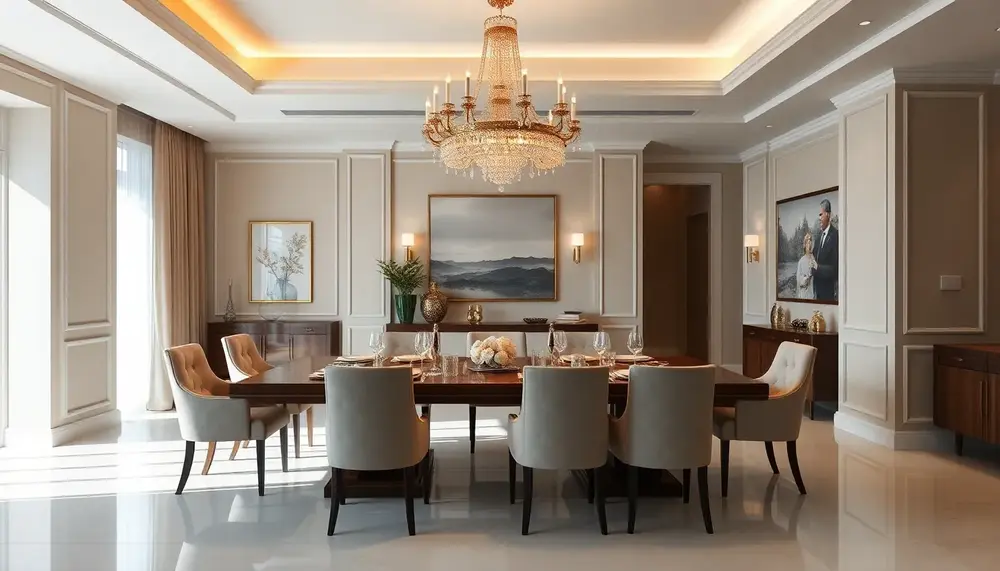
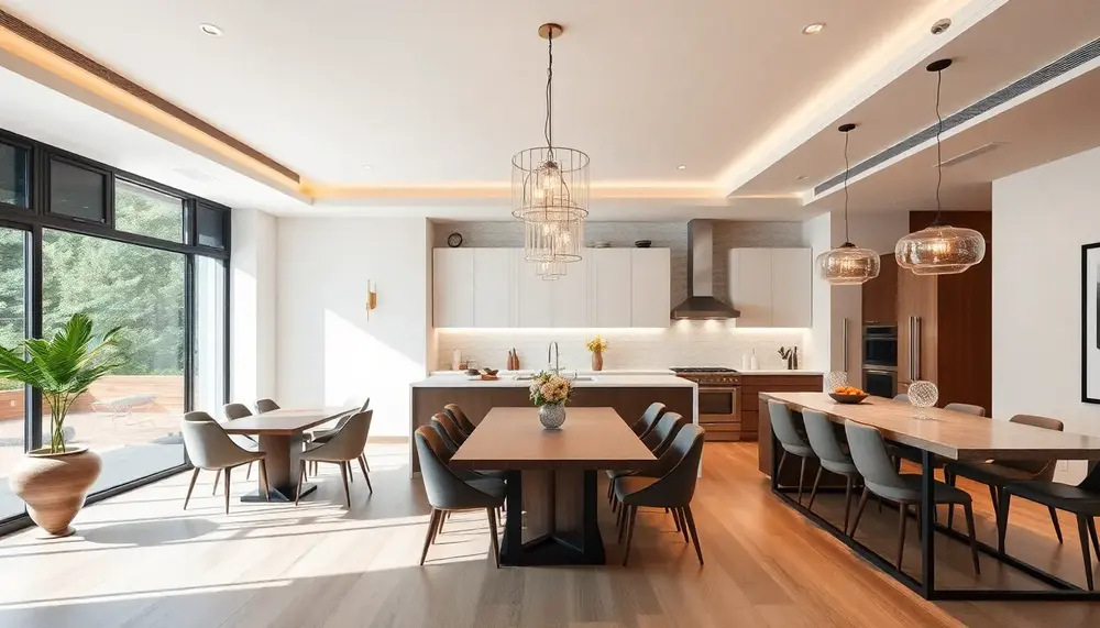
Dining Room Atmosphere: More Than Just a Table
The dining room suffers more from under-investment than almost any other space. Many households allocate significant budgets to kitchens and living rooms, then furnish the dining area as an afterthought. This is a strategic mistake — the dining room is where meals lasting two to three hours unfold, and acoustic comfort, lighting control, and tactile material quality directly affect that experience. Hard floors plus a large glass table in a room with no soft furnishings can push reverberation times above 0.8 seconds, making conversation genuinely fatiguing.
For those committed to making this space exceptional, studying high-end dining room interior design reveals a consistent pattern: dimmable overhead lighting centered precisely over the table (not the room), upholstered seating that absorbs sound and invites longer stays, and a considered relationship between table scale and room volume. A 2400mm dining table in a 4x4m room will dominate uncomfortably — the standard guideline is 900mm of clearance on all sides for comfortable chair movement.
- Ceiling height vs. chandelier scale: In rooms under 2.7m, flush or semi-flush fixtures prevent that cramped, oppressive feeling
- Table material durability: Solid oak or walnut with a hardwax oil finish handles daily use and develops character; glass and high-gloss lacquer demand constant maintenance
- Rug sizing: The rug under a dining table must extend at least 600mm beyond all chair legs when pulled out — undersized rugs are among the most common and visually destabilizing mistakes
Workspace and Office Interiors: Designing for Prestige, Focus, and Productivity
The workspace is no longer just a functional necessity — it's a direct expression of professional identity, company culture, and ambition. Research from the World Green Building Council found that well-designed office environments can increase individual productivity by up to 15%, while poor acoustics alone account for an 86% drop in concentration. These numbers make a compelling case: office interior design is a strategic investment, not an aesthetic indulgence.
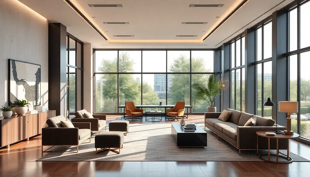
The most effective office interiors balance three competing demands — visual authority, cognitive comfort, and operational efficiency. Zoning is the foundational principle here. Dedicated focus zones with acoustic paneling or glass partitions, collaborative spaces with writable surfaces and flexible seating, and formal meeting areas with deliberate material choices all serve distinct psychological functions. The mistake most offices make is treating the floor plan as a single-purpose space when human work is inherently multi-modal.
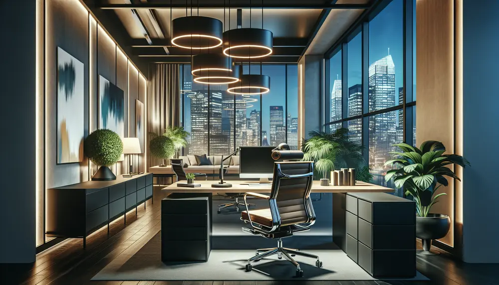
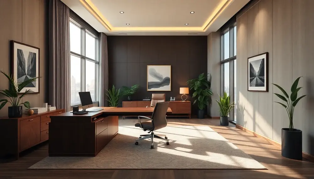
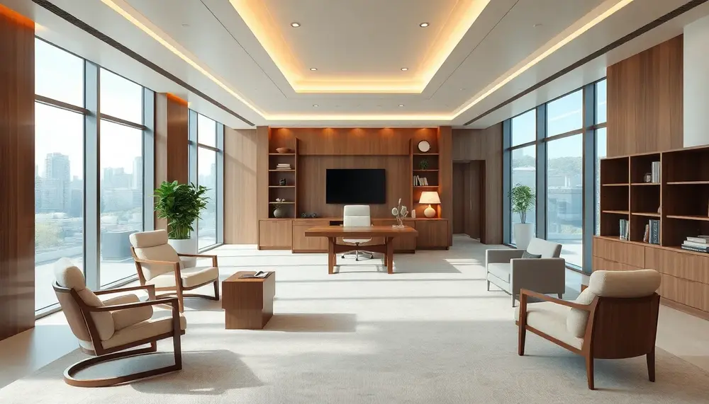
Crafting an Executive Environment That Commands Respect
Senior leadership spaces carry a disproportionate weight in how clients and stakeholders perceive an organization. The materials, proportions, and lighting in a CEO's office communicate credibility before a single word is spoken. If you're working on designing a corner office that signals executive authority, the key variables are ceiling height utilization, desk placement relative to natural light sources, and material contrast — pairing dark walnut or smoked oak with brushed brass hardware, for instance, creates depth without ostentation. Symmetry in the furniture arrangement reinforces perceived stability and control.
For private cabin offices within larger open-plan environments, the design challenge shifts toward creating psychological enclosure without physical isolation. Transforming a compact office cabin into a high-status workspace often comes down to three details: a solid door rather than glass (privacy signals rank), statement lighting such as a single architectural pendant, and a curated back-wall treatment — built-in shelving with intentional styling, or a textured stone panel behind the primary seating position.
Luxury Principles Applied to Commercial Office Spaces
Many firms mistakenly reserve premium materials for client-facing reception areas while neglecting the daily work environment. This is a missed opportunity. When you apply high-end design principles across the full office footprint, the cumulative effect on staff morale and retention is measurable — LinkedIn's Workplace Culture research consistently links physical environment quality to employee satisfaction scores. Practical upgrades include acoustic ceiling tiles with a mineral finish, ergonomic task seating in genuine leather rather than vinyl, and concealed cable management systems that eliminate visual noise.
Lighting deserves particular attention. A layered lighting strategy — ambient at 300–500 lux for general tasks, supplemented by 750+ lux at individual workstations and accent lighting for architecture — is the single most cost-effective upgrade most offices can make. If you're committed to a comprehensive approach, exploring how to build a workspace environment that reflects genuine professional excellence means addressing everything from floor material acoustics to the scent profile of the space through subtle diffusion systems.
- Biophilic elements: Indoor plants or living walls reduce stress cortisol levels by approximately 37% in documented workplace studies
- Color temperature: 4000K–5000K LEDs support alertness in focus zones; 2700K–3000K in breakout areas encourages decompression
- Desk-to-window ratio: Aim for no workstation more than 7–8 meters from a natural light source
- Noise floor management: Background sound masking systems maintain ambient noise at 45–48 dB to reduce conversational distraction
Small Spaces and Specialty Rooms: Maximizing Impact in Apartments, Nurseries, and Bathrooms
Designing small or purpose-built spaces demands a fundamentally different mindset than tackling an open-plan living area. The constraints are real — a 45-square-meter apartment, a nursery that doubles as a future toddler room, a bathroom under 6 square meters — but so are the opportunities. The most successful small-space interiors don't fight their limitations; they exploit them with surgical precision.
Apartment Living: Density Without Sacrifice
The core challenge in compact apartments is visual density — too much furniture, pattern, or color in a tight footprint creates a space that feels chaotic rather than curated. A reliable starting rule: limit your primary furniture pieces to those that serve at least two functions. An Ottoman with internal storage, a dining table that folds against the wall, shelving built into otherwise dead wall space above doorframes. These decisions compound quickly. If you want a deeper framework for tackling this systematically, studying how professional designers approach apartment-scale interiors reveals that vertical space — specifically the zone between 180cm and the ceiling — is almost universally underused.
Color strategy in apartments is equally non-negotiable. Painting a single accent wall in a saturated tone while keeping remaining walls in a warm off-white (think Farrow & Ball's "Pointing" or Benjamin Moore's "White Dove") creates depth without visual compression. Mirrors positioned to reflect natural light sources can effectively double perceived room size — a 90cm x 120cm mirror placed opposite a window is worth more than any square footage you could add.
Nurseries: Designing for Now and for Three Years From Now
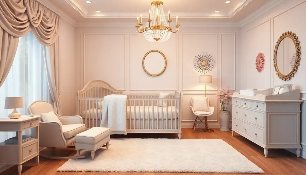
Nursery design is one area where future-proofing directly affects your return on investment. The average family redecorates a child's room at least twice before age seven, largely because they designed for infancy rather than the child's trajectory. The smarter approach: invest in quality, neutral-toned furniture — solid wood cribs that convert to toddler beds, dressers that transition seamlessly to a school-age room — and layer in age-specific personality through textiles and accessories that are cheap and easy to swap. If you're drawn toward a more elevated aesthetic, exploring high-end nursery concepts shows how premium materials like linen drapes, hand-painted murals, and solid brass hardware can create a room that genuinely grows with the child.
Lighting in nurseries is routinely underplanned. You need three distinct layers: a dimmable overhead for general use, a low-lux nightlight for overnight feeds (under 10 lux to avoid disrupting melatonin production), and a focused task light for the changing area. Installing a dimmer switch during initial setup costs under €30 and saves significant retrofitting later.
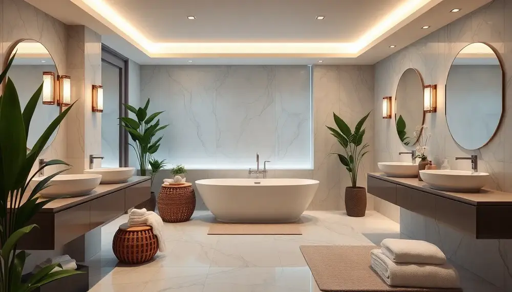
Bathrooms and Hallways: The Forgotten Design Frontiers
Bathrooms under 5 square meters respond dramatically to a few targeted interventions: large-format tiles (60x60cm or larger) with minimal grout lines visually expand the floor plane, wall-hung vanities expose floor space that makes the room read larger, and a single luxurious material — book-matched marble on one wall, a statement freestanding fixture — elevates the entire space. The case for treating even a powder room as a genuine design statement is compelling; transforming a small toilet interior into something extraordinary costs less per square meter than almost any other room in the home.
Hallways suffer from a different problem: they're treated as circulation space rather than design space. Installing built-in storage, a console table, or deliberate lighting in an entrance hall creates the first impression that sets expectations for the entire home. The practical and aesthetic potential of hall furniture as a design tool is consistently underestimated — a well-chosen piece here communicates the design language of everything that follows.
Lighting Design as a Room-Shaping Tool: Layers, Fixtures, and Spatial Psychology
Lighting does more than illuminate — it fundamentally reshapes how we perceive volume, proportion, and atmosphere within a space. A ceiling that feels oppressively low at 2.4 meters can read as intimate and cozy with the right downward-directed wash of warm light. Conversely, a narrow corridor gains perceived width when wall sconces at 1.5-meter intervals push light horizontally across the surfaces. Understanding this spatial psychology is what separates decorative lighting from genuine architectural lighting design.
The Three-Layer Principle: Ambient, Task, and Accent
Professional designers universally work with a three-layer lighting model, and collapsing these layers into a single overhead source is the single most common mistake in residential interiors. Ambient lighting provides base illumination — typically 150 to 300 lux for living spaces. Task lighting brings that up to 500–750 lux at work surfaces, countertops, or reading zones. Accent lighting operates at a ratio of roughly 3:1 to 5:1 over ambient levels, creating the focal drama that gives a room its character. The interplay between these three layers, controlled by separate dimmer circuits, gives you full tonal range — from functional daytime brightness to evening moods at 30% ambient with accents running at full power.
Kitchens are where this layering becomes absolutely critical. Overhead fixtures alone create harsh shadows exactly where you're using knives and reading recipe details. If you're planning a kitchen renovation, studying how dedicated kitchen lighting design integrates task strips, pendant fixtures, and ambient sources into a coherent system will prevent the most common and costly retrofit mistakes.
Fixture Selection and Directional Strategy
Track lighting systems offer one of the most flexible solutions for rooms that serve multiple functions throughout the day — a dining area that doubles as a home office, for instance, benefits enormously from adjustable directional heads. When configured thoughtfully, track systems can replace four or five separate fixture types. For practical inspiration on how to deploy these systems without sacrificing aesthetic quality, exploring designer approaches to track lighting reveals how commercial-grade flexibility translates into residential spaces.
Color temperature is equally decisive. 2700K–3000K (warm white) suits bedrooms, living rooms, and dining areas where relaxation and social warmth are priorities. 4000K (neutral white) performs better in kitchens, studios, and bathrooms where accurate color rendering matters. Mixing temperatures within a single open-plan space without intention creates visual discord that users feel but rarely consciously identify — a subtle reason a room never quite feels right.
- Place accent lights at 30° angles from artwork or architectural features for optimal shadow depth without glare
- Install dimmers on all circuits — the hardware cost is minimal; the versatility gain is enormous
- Use CRI 90+ sources wherever color accuracy matters: kitchens, dressing areas, art walls
- Avoid single central pendant fixtures in rooms wider than 4 meters — they create a dark perimeter effect
Regional climate and daylight conditions also influence optimal lighting strategy in ways many designers underestimate. Projects in high-daylight environments require different calibration than those in northern latitudes — something specialists who work with the diffused, low-angle light typical of Dutch interiors understand deeply and encode into their fixture placement and lumen calculations. Similarly, contemporary projects where lighting must compensate for intense external glare while maintaining interior warmth demonstrate how adaptive design thinking produces spaces that feel precisely calibrated rather than generic.
FAQ about Room Design Inspiration
What key elements should I consider when designing a room?
Key elements include defining a focal point, establishing a color palette, and ensuring that the function of the space dictates its form. It's important to create a cohesive design that reflects your personal style.
How do I create a balanced color scheme for my space?
To create a balanced color scheme, choose a dominant color for the walls, select a secondary color for larger furniture pieces, and use accent colors in decor items. Remember to use colors that complement each other to achieve harmony.
How can I maximize space in a small room?
To maximize space, opt for multifunctional furniture, use vertical storage solutions, and keep the color scheme light to give an illusion of space. Mirrors can also be strategically placed to reflect light and create a more open feel.
What role does lighting play in room design?
Lighting plays a crucial role in setting the mood and functionality of a room. A layered approach that includes ambient, task, and accent lighting can enhance the visual appeal and make spaces more inviting.
How do I choose the right furniture for my room?
Choose furniture that matches the scale of your room and fits the overall style you want to achieve. Prioritize quality and comfort, and consider incorporating statement pieces that add character to the space.